
Project
The University Of Phoenix Website ADA Color Study
The University Of Phoenix Website ADA Color Study
Goal
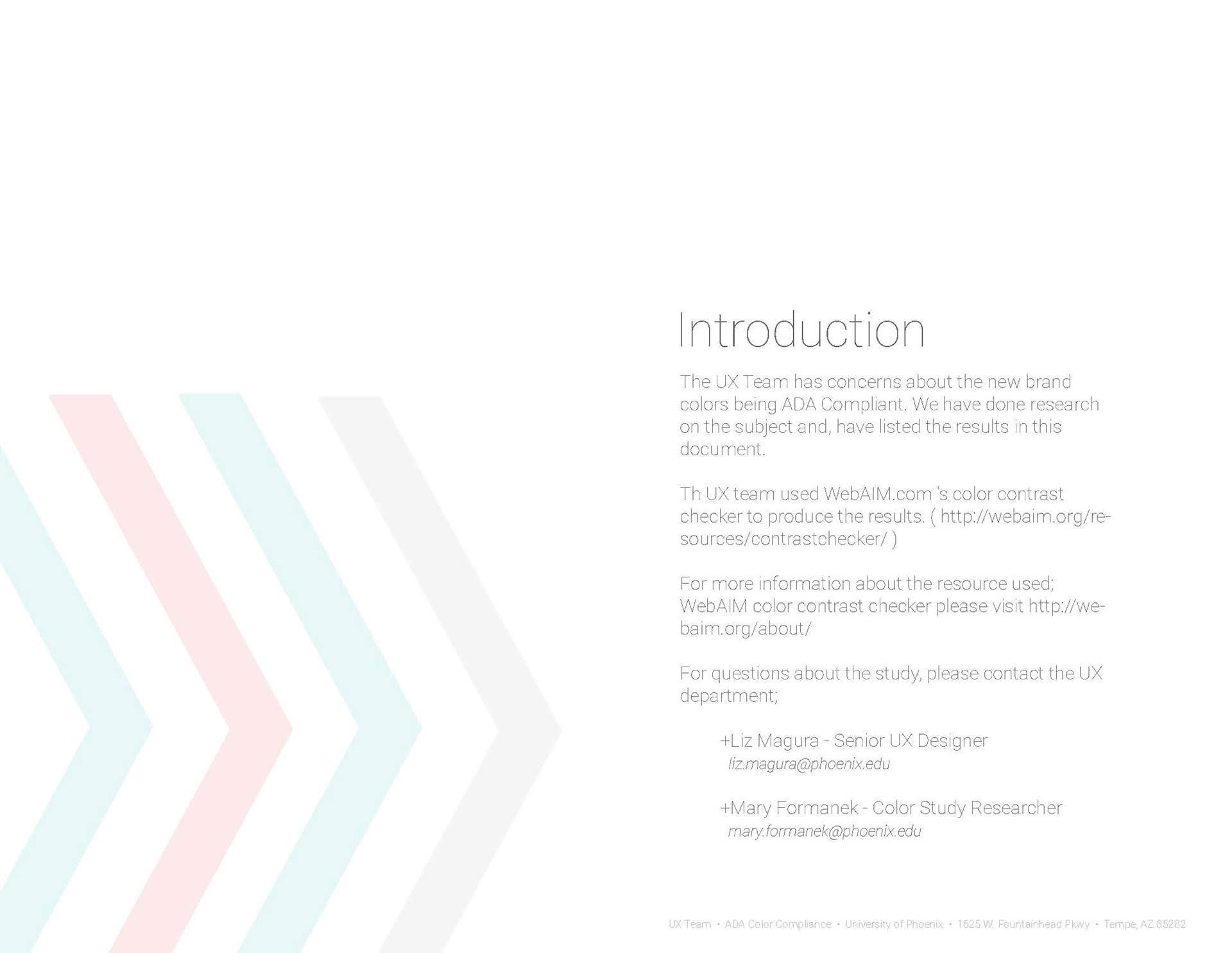
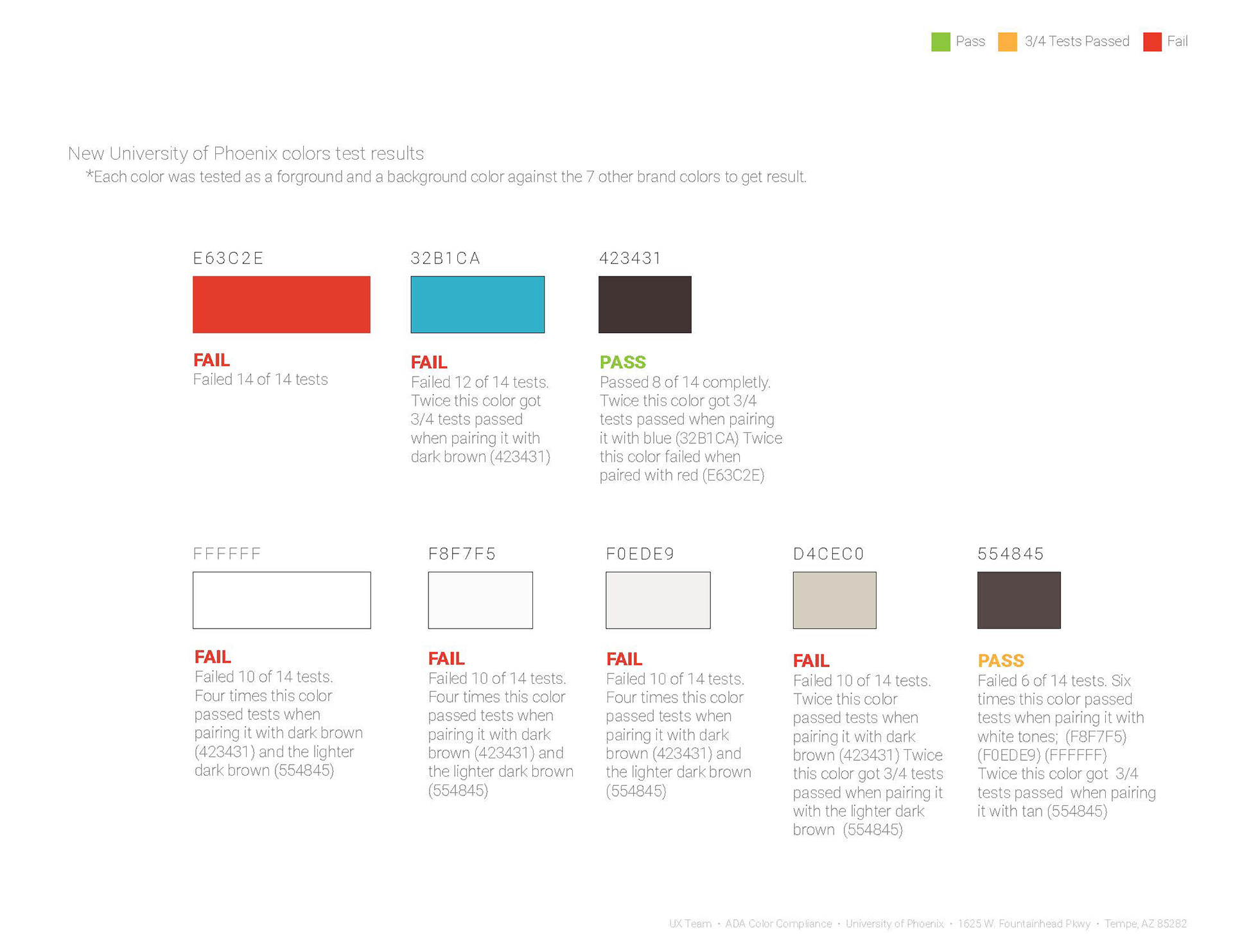
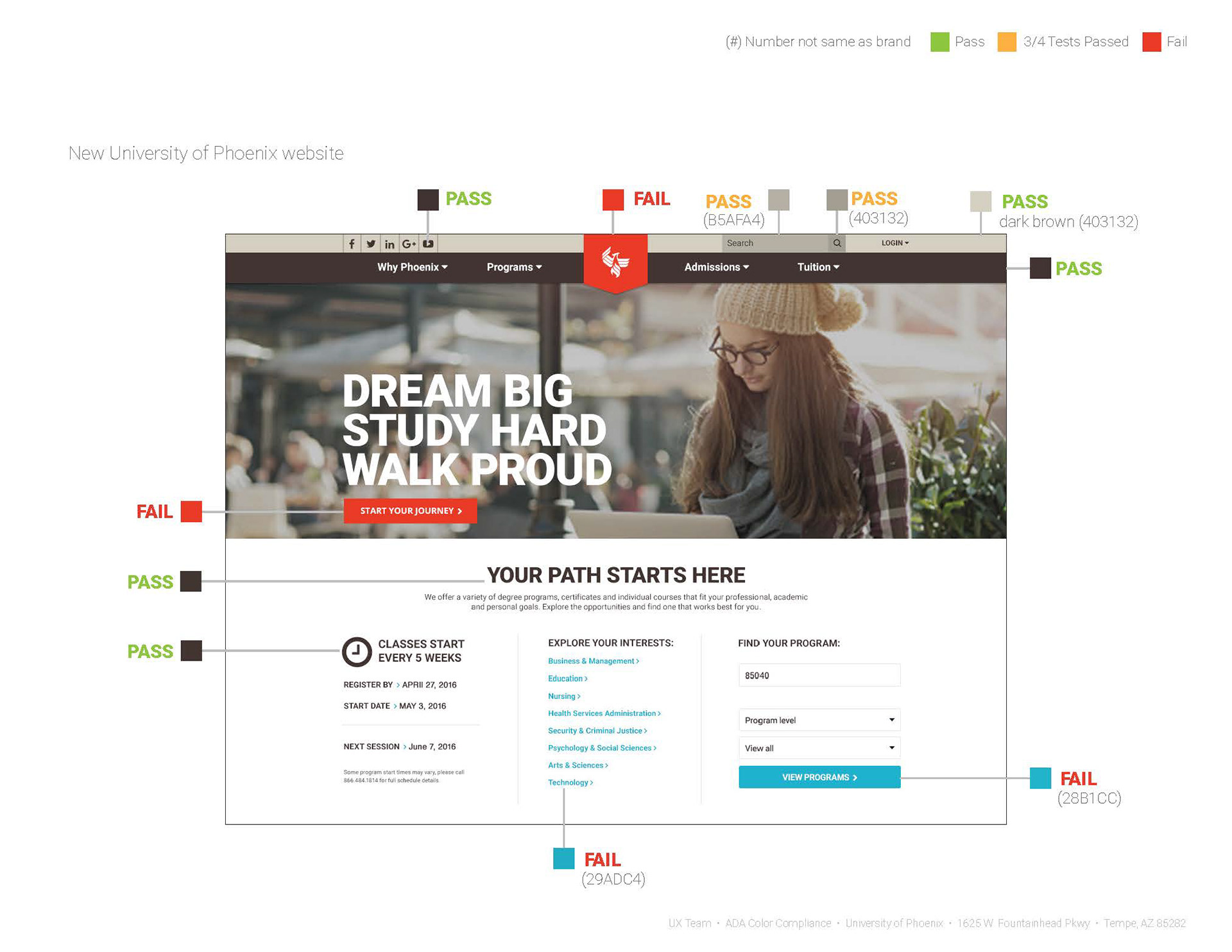
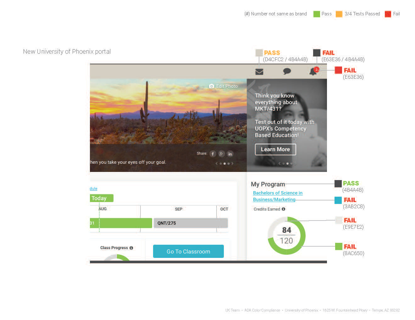
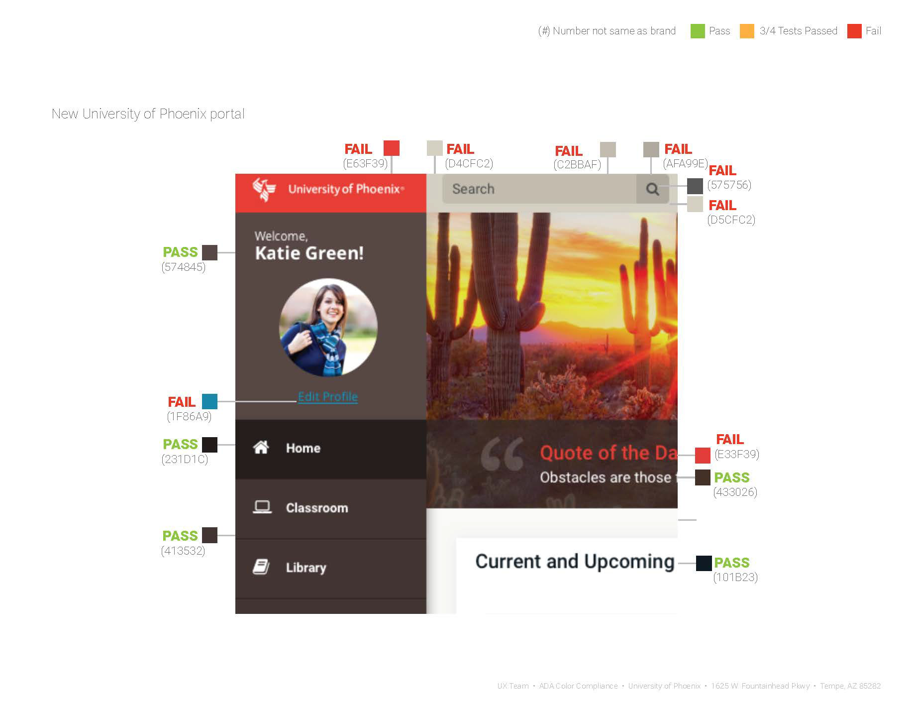
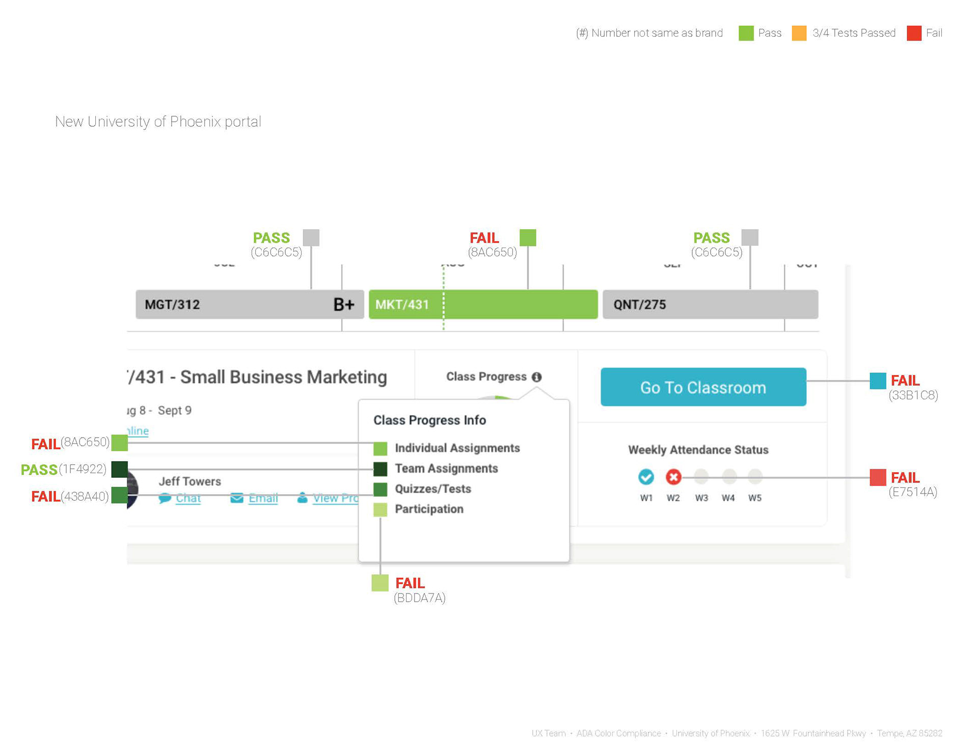
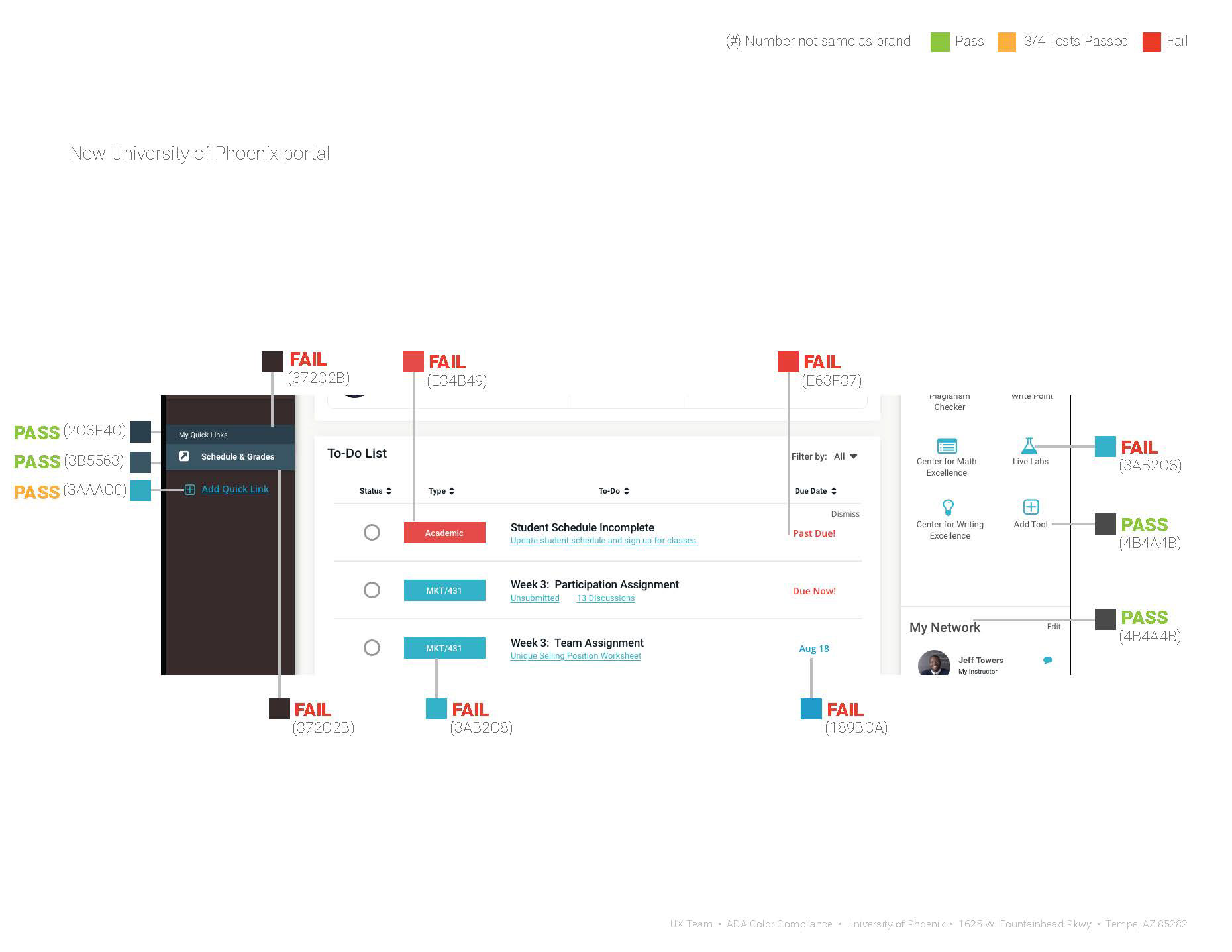
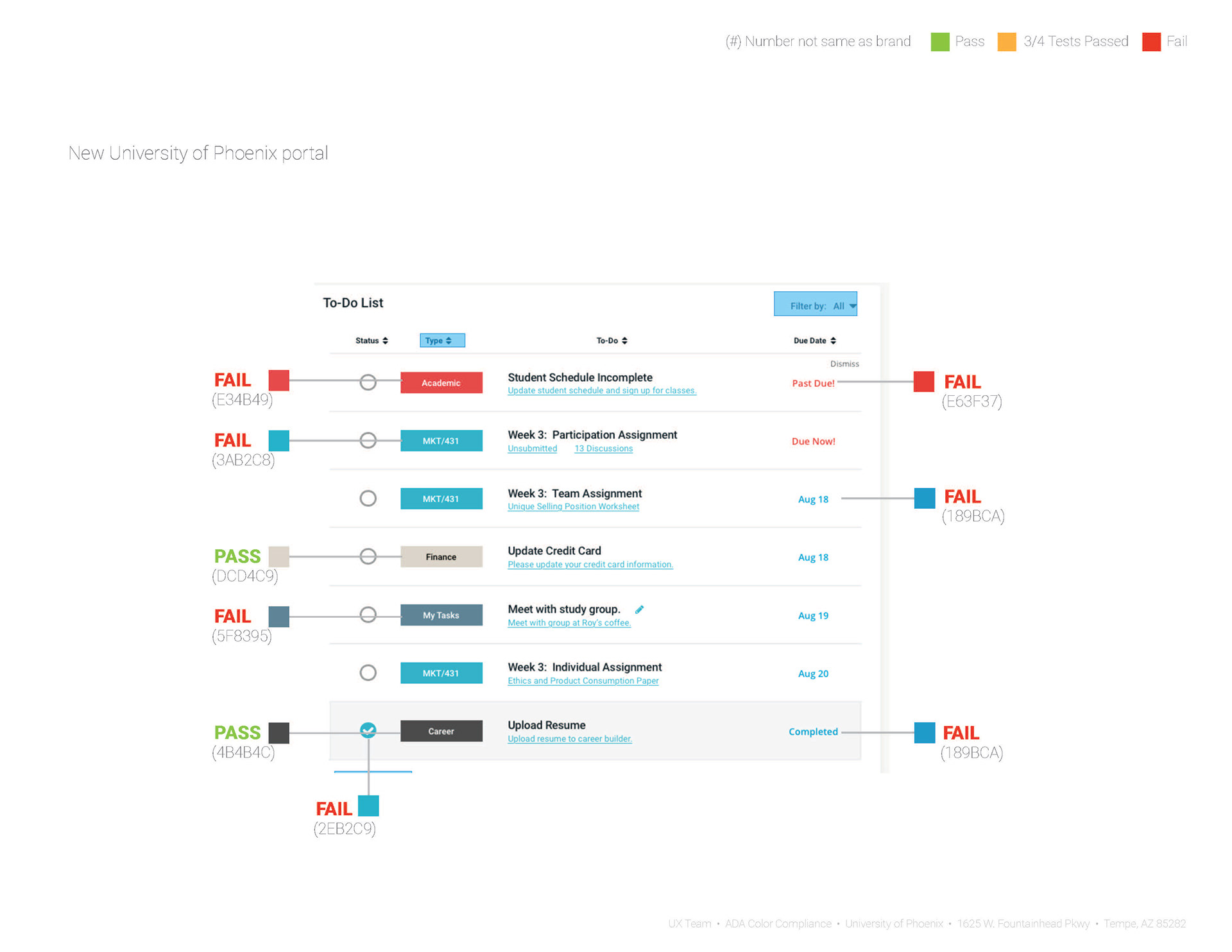
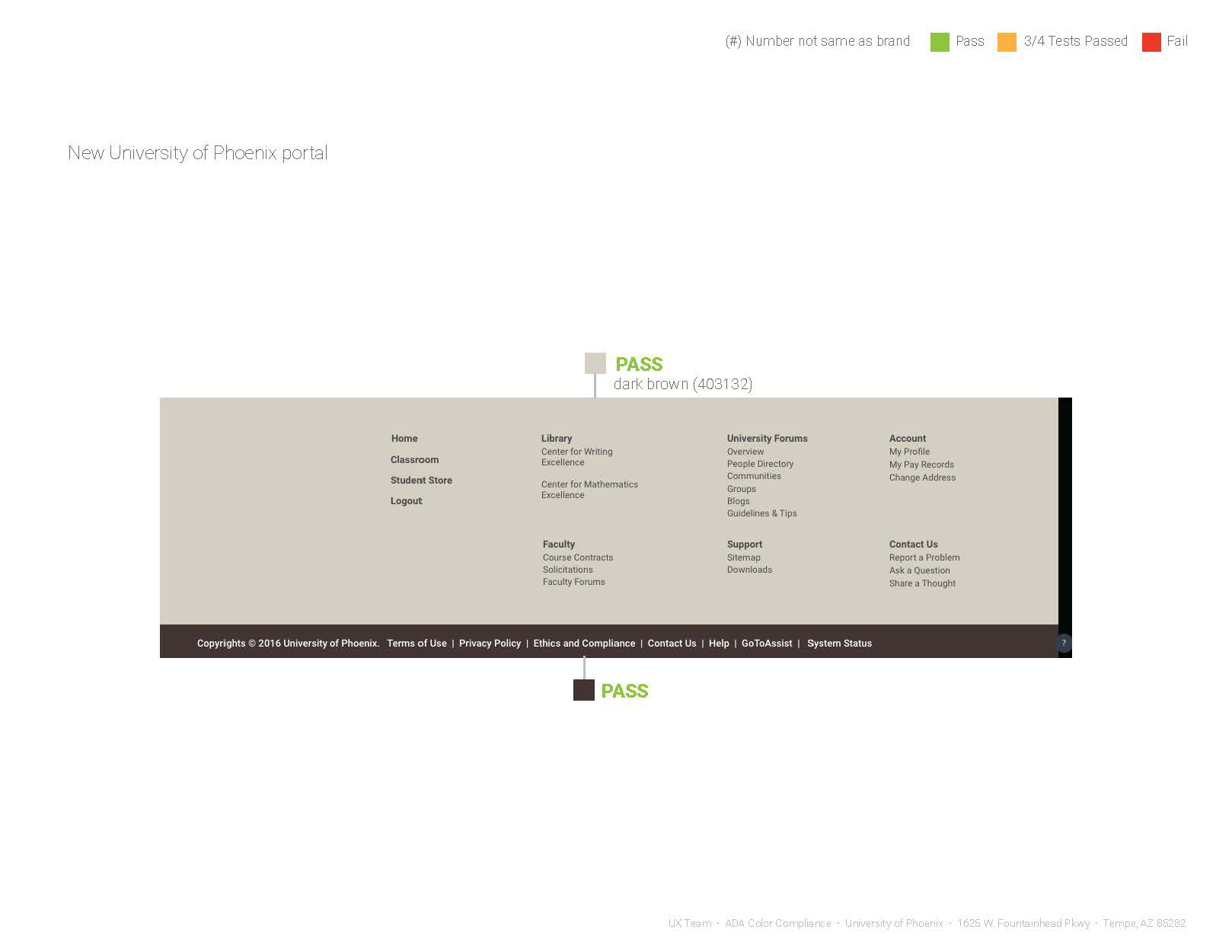
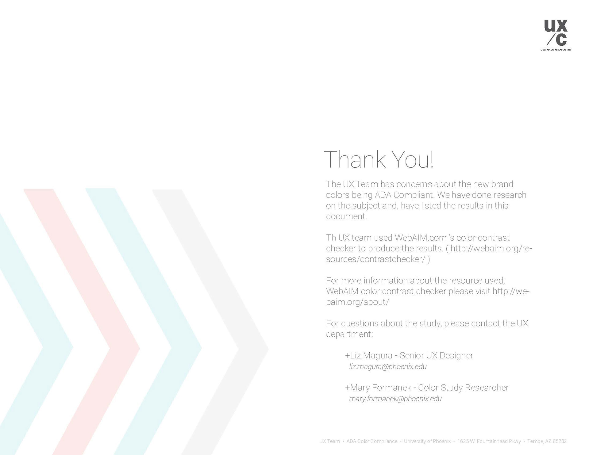
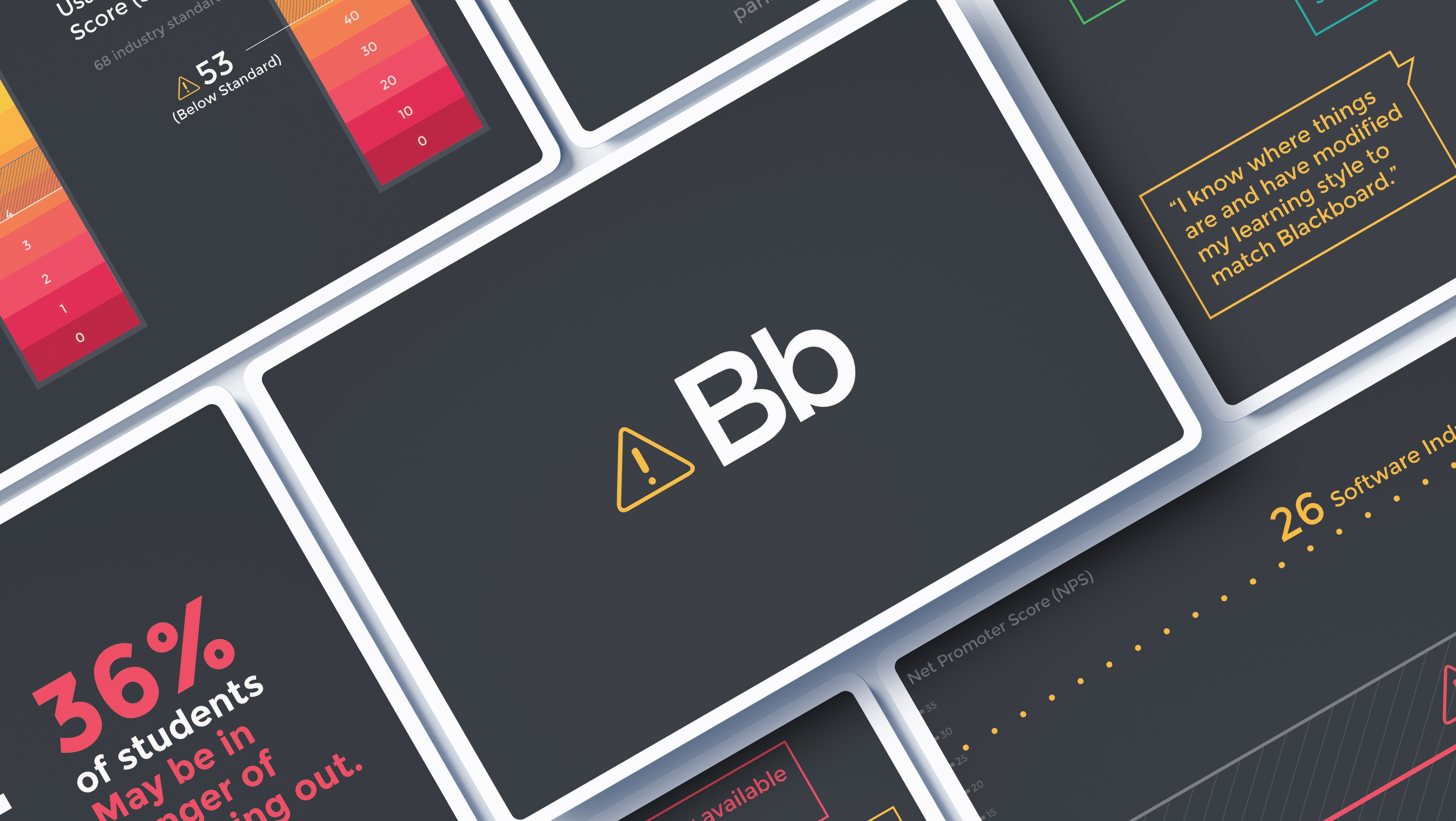
As an educational institution, the University of Phoenix is legally required to ensure that all interfaces are ADA-compliant. Shortly after my arrival, the university partnered with an external design firm for a rebranding initiative in response to recent negative press and lawsuits. The UX team was tasked with assessing whether the new branding colors could be utilized on our web-based platforms while maintaining ADA compliance. I conducted a comprehensive study and developed a detailed report and presentation to communicate my findings.
As an educational institution, the University of Phoenix is legally required to ensure that all interfaces are ADA-compliant. Shortly after my arrival, the university partnered with an external design firm for a rebranding initiative in response to recent negative press and lawsuits. The UX team was tasked with assessing whether the new branding colors could be utilized on our web-based platforms while maintaining ADA compliance. I conducted a comprehensive study and developed a detailed report and presentation to communicate my findings.
Role
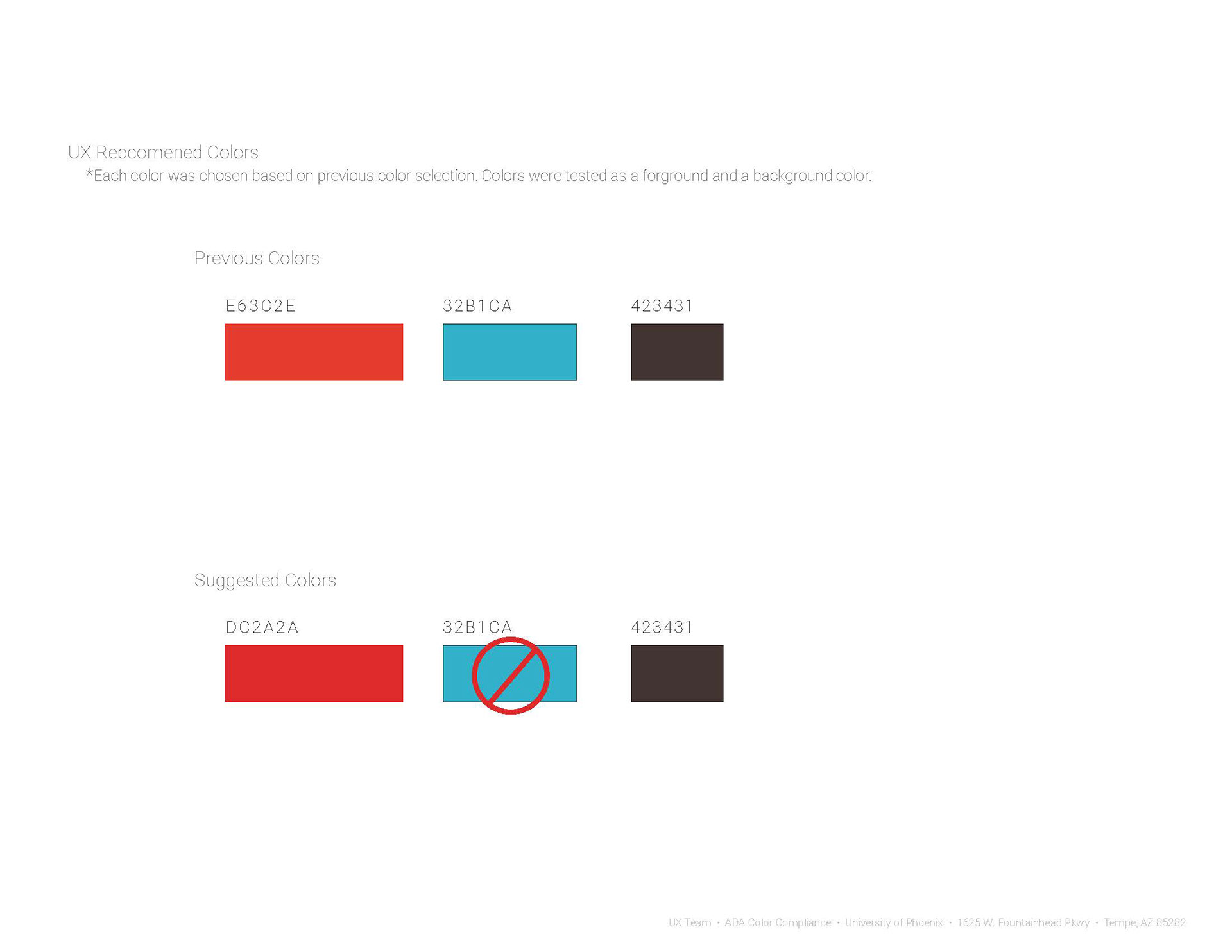
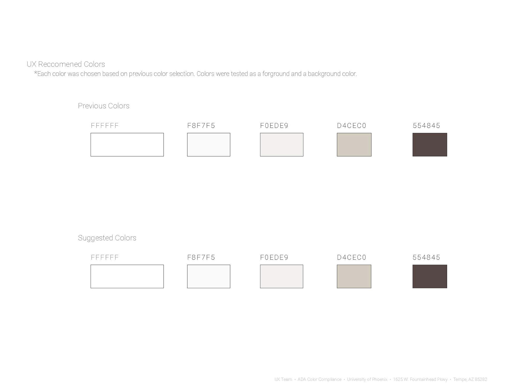
I was the lead UX designer, lead UX researcher and visual designer on this project. I tested each color for ADA compliance. I then took my findings and made them into an easily digestible, aesthetically pleasing slide deck. I presented this slide to the company leaders.
Product & Team Information
Designed in Adobe Illustrator. Tested in a state-of-the-art on-site testing lab.