Project
Discount Tire In-Store Kiosk
The In-store kiosk design was inspired by a store in Oregon that was, frankly, breaking the corporate rules for all the right reasons.
Discount Tire In-Store Kiosk
The In-store kiosk design was inspired by a store in Oregon that was, frankly, breaking the corporate rules for all the right reasons.
Goal
Coming Soon!
Coming Soon!
Role
Lead UX Designer
Product & Team Information
Product: Internal UX Product. Tools: Sketch, InVision, Proto.io. Team Flow: Waterfall
This project was a waterfall production style with an internal UX cycle. If you would like to learn more about the UX cycle, please refer to this article.
Lead UX Designer
Product & Team Information
Product: Internal UX Product. Tools: Sketch, InVision, Proto.io. Team Flow: Waterfall
This project was a waterfall production style with an internal UX cycle. If you would like to learn more about the UX cycle, please refer to this article.
The Kiosk Story
The In-store kiosk design was inspired by a store in Oregon that was, frankly, breaking the corporate rules for all the right reasons.
In 2018, before the pandemic was thought, this store manager understood that his customers deserved better than to stand in line, asking everyone in the store if they were also in line. Not knowing when their turn was up. Not having any way to go wait in their car until their name was called. In fact, this particular store had people line up at 6:30 am. They did not open until 8 am. People would wait for over an hour outside in the cold rain to keep their place in line. As a result, the owner opened the store by himself before regular hours to prevent his employees from working overtime and keep his customers warm and happy.
Please continue reading the story below while viewing the designs.
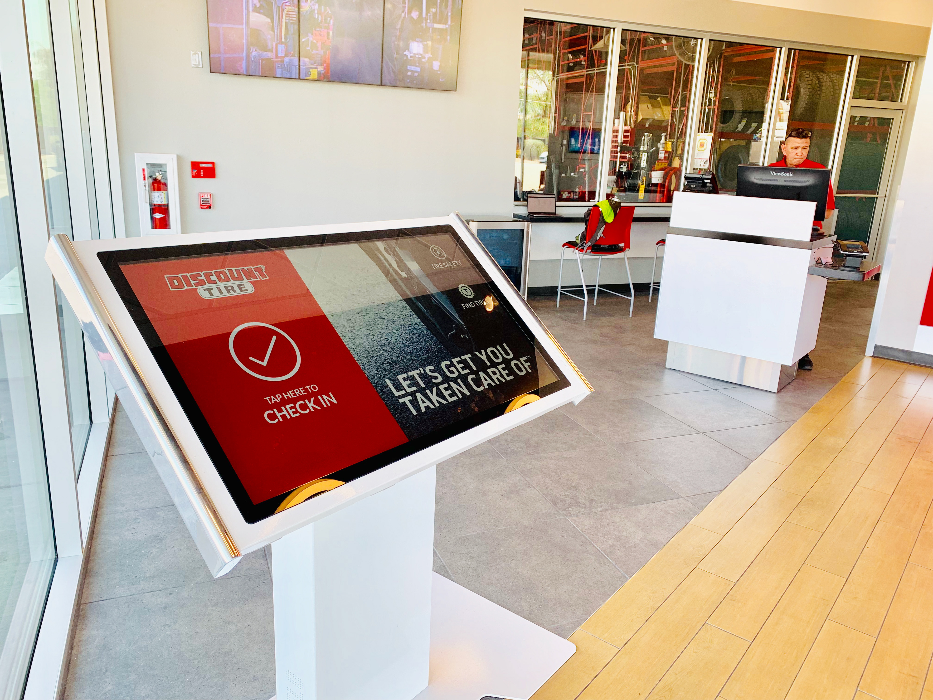
As this went on, he decided to try a new approach. He bought an iPad and attached it to a stand. He then brought in one of his own TVs and mounted it to the wall. He did some research and found an app that created a waitlist. It would let customers enter their emails or mobile numbers to be notified if they were next. He signed up for a non-corporate-approved app, put it on his iPad, and placed it near the door. He then connected the waitlist app to the TV he brought from home, to display who was coming up next.
In the early mornings, he would drive in, leave the iPad outside, and let the customers wait in their cars before officially opening the shop.
A district manager caught wind of the store manager's setup and brought the UX team in to investigate.
What the team saw was a well-oiled machine. People were not standing around the stores, frustrated, waiting for unknown amounts of time, asking employees working the desk how much longer. The customers all seemed content, watching the TV for their turn. The customers also did not need to be told what to do when they arrived.
The American public of all ages has already been conditioned to check in when they see an iPad on a stand. I wouldn't call it human nature, but it was broadly understood for all ages who walked in the shop doors.
The only time the store did not seem to be in perfect balance and harmony was when the iPad died. Suddenly, you could feel the air shift. Customers tried to figure out the iPad but were frustrated when the screen didn't turn on. They didn't know where to stand in line. A lot of customers started to form a line behind the dead iPad. When it became apparent that the battery needed to be charged, customers were unsure who was already in line and who was not. All the issues with the waiting room in all the other stores around the country came tumbling back to that store.
The team spent three days in Oregon, returning to the store for two whole days to sit and watch how the customers interacted with the technology and how it affected the entire store flow. The team brought back insights that influenced the design and thought behind every aspect of the kiosk.
When I was tasked with the project, my first thought was, 'How do I preserve what is already working while enhancing it to make it better and making it feasible to do across all of our stores?' I compared the data brought back with the data collected from other stores that are not MacGruber-ing solutions. From there, I pitched the idea of linking multiple products.
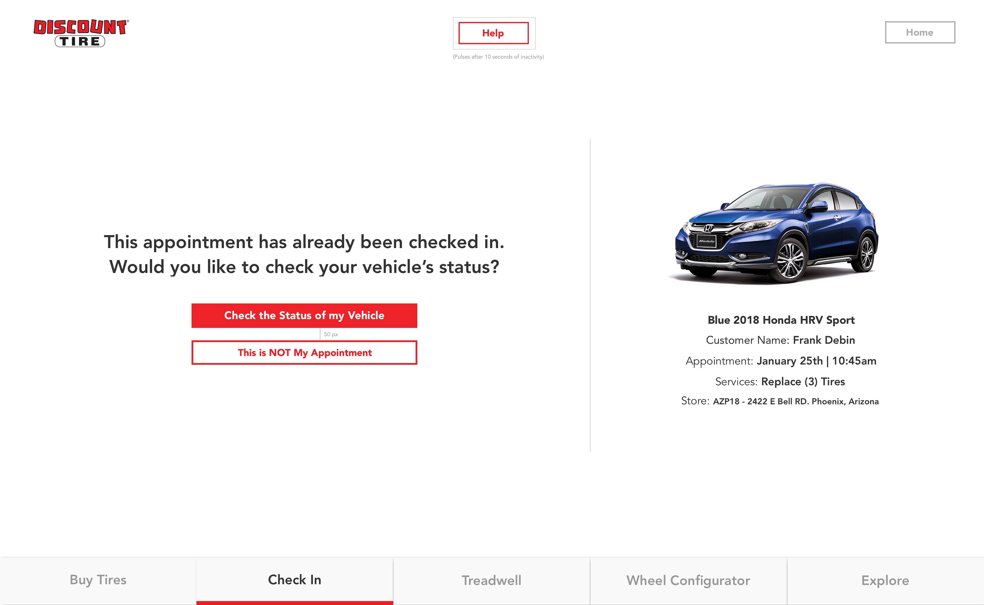
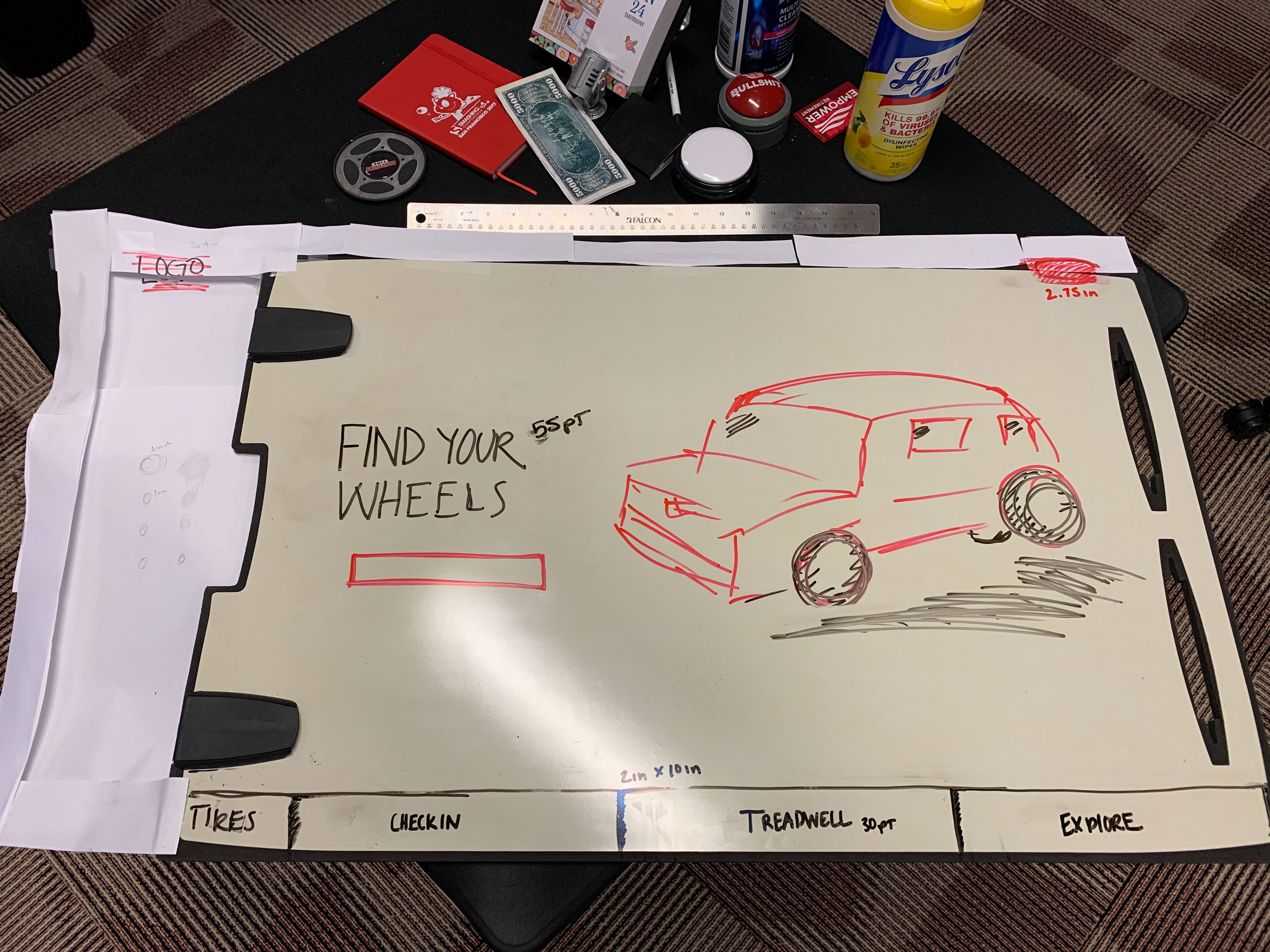
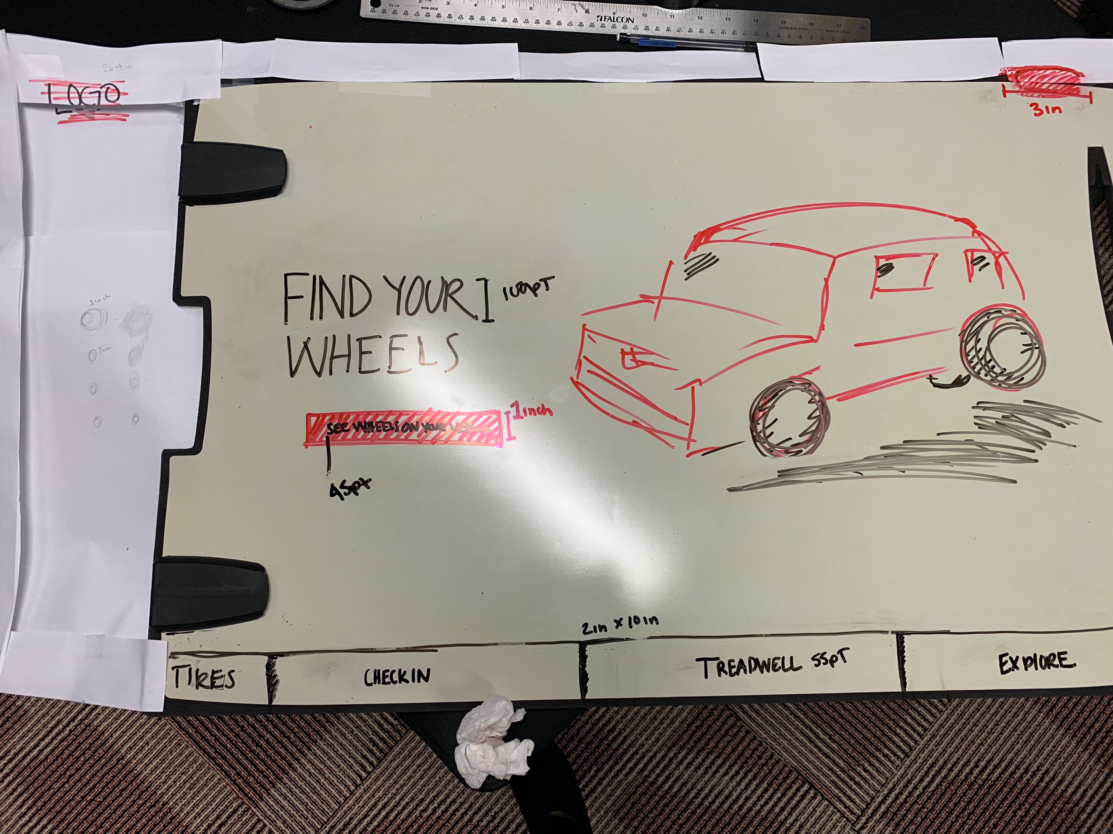
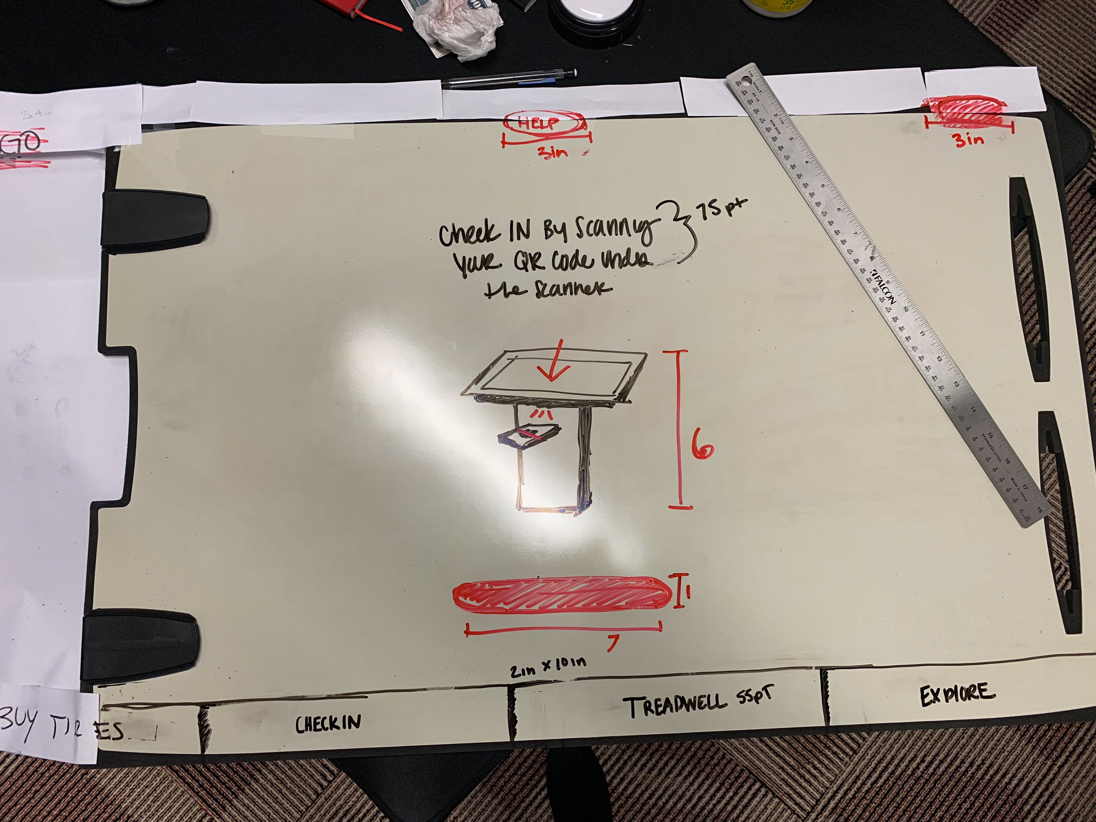
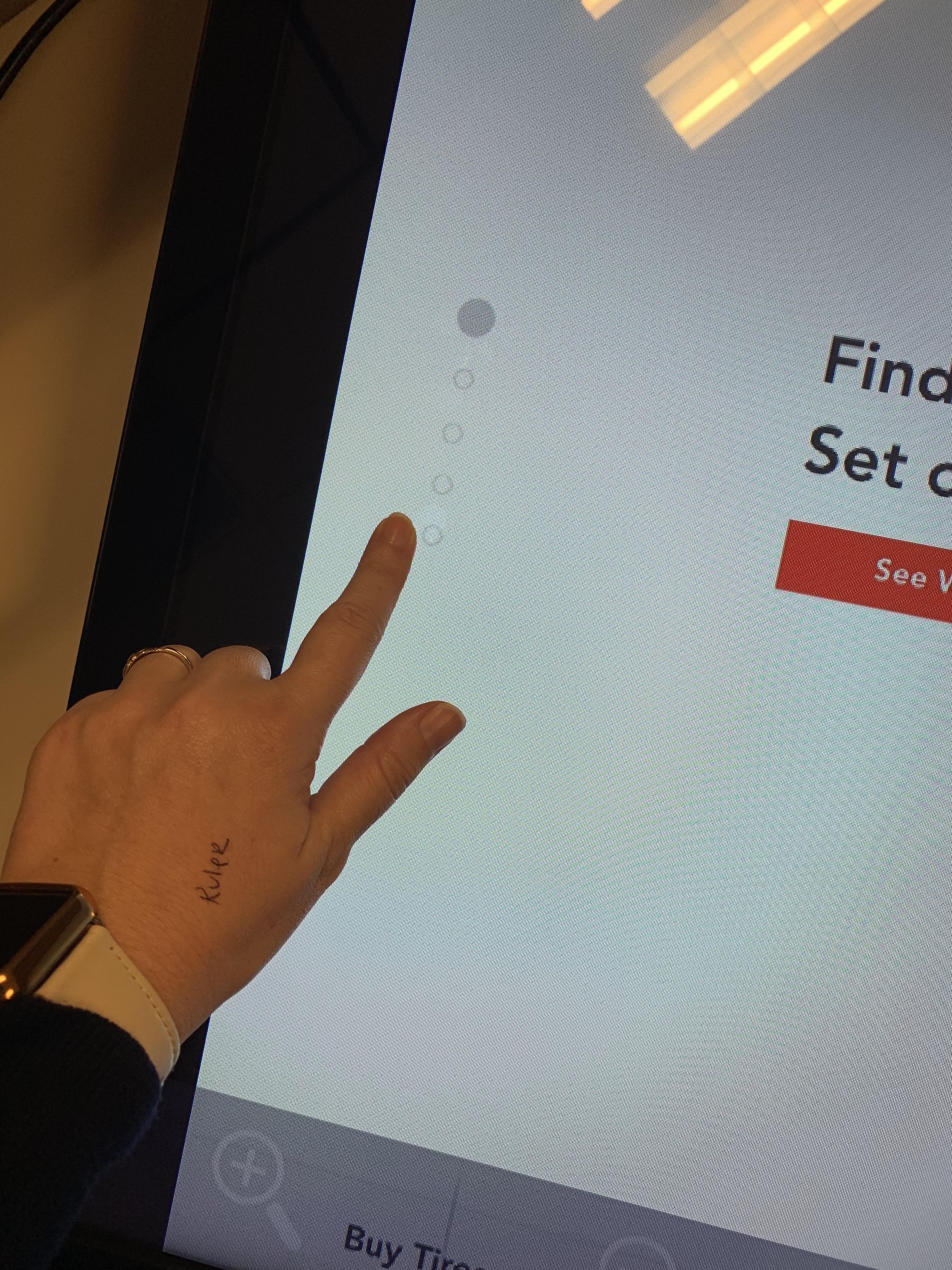
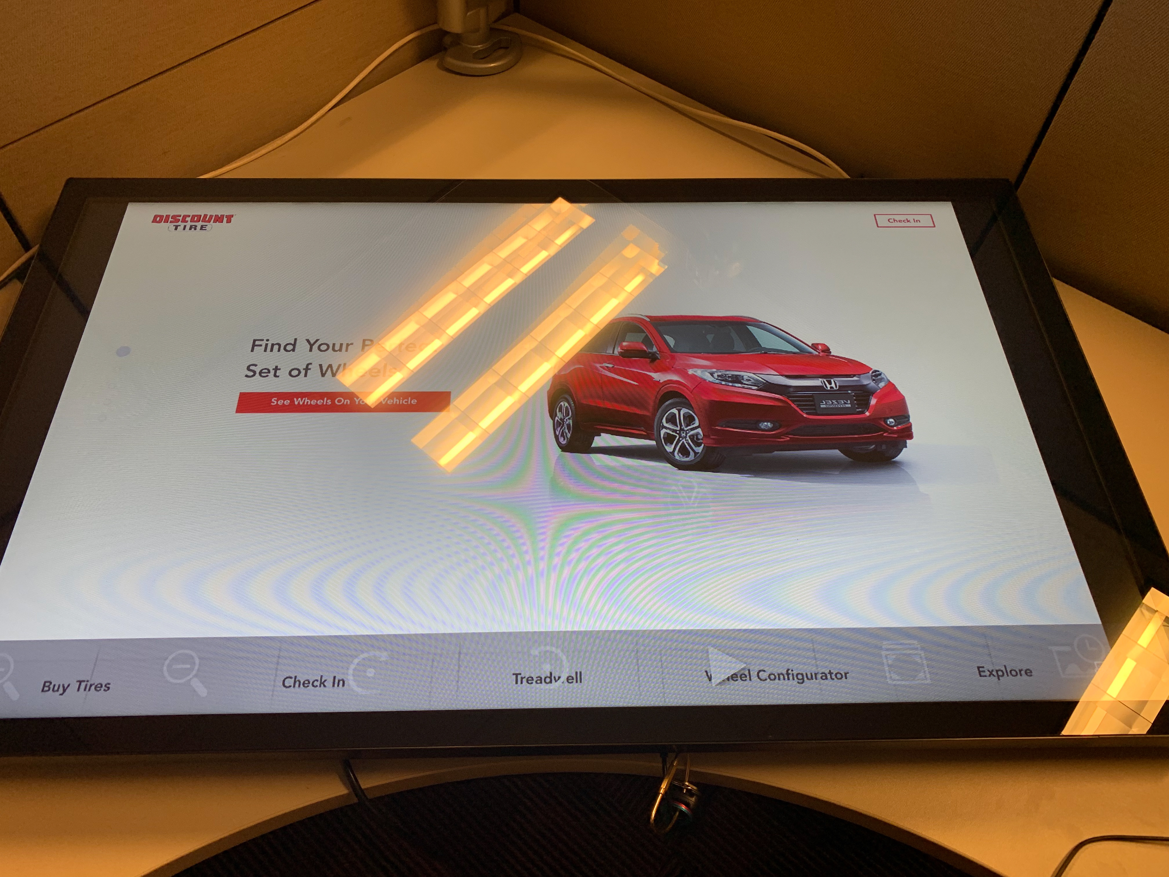
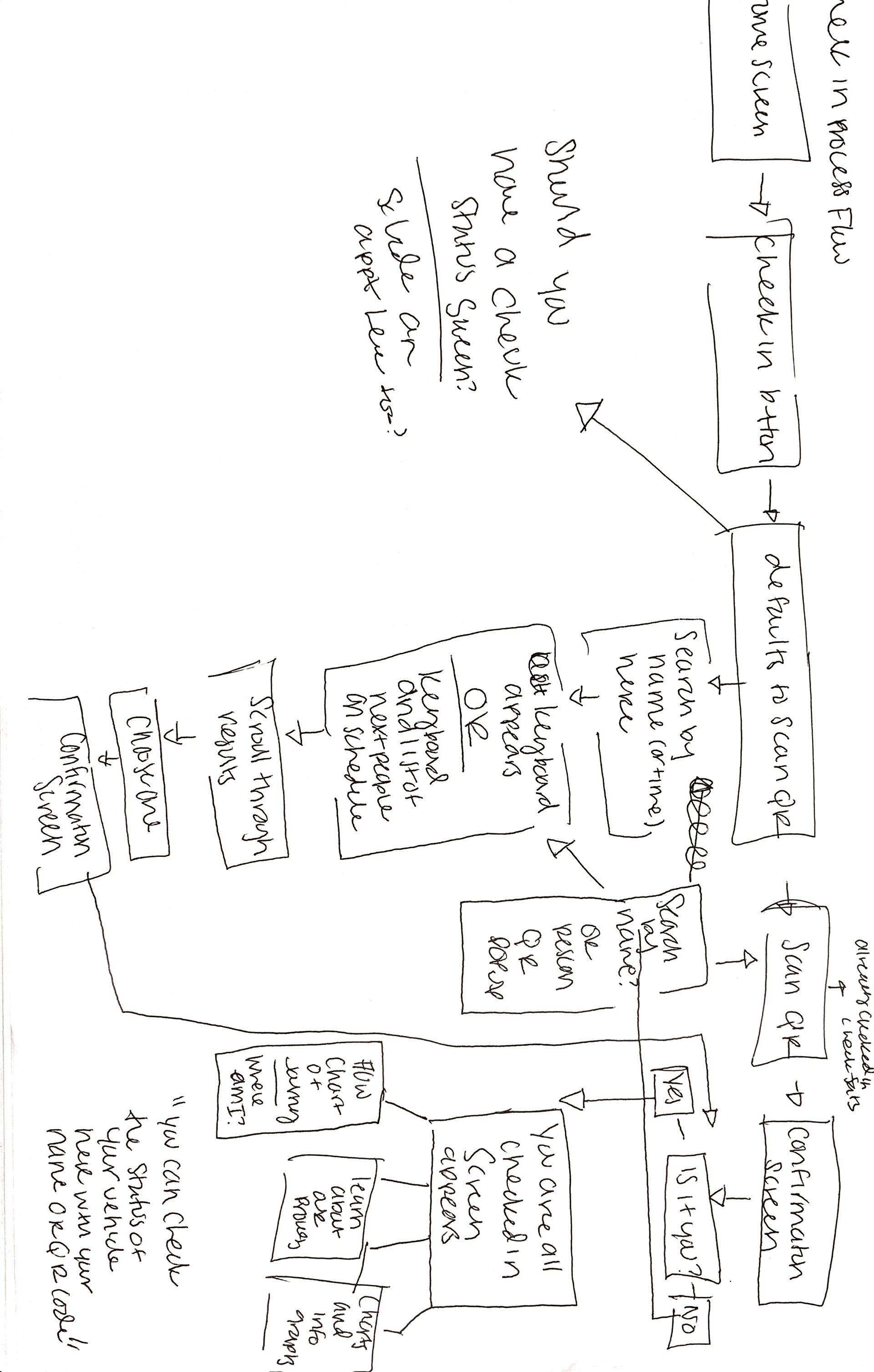
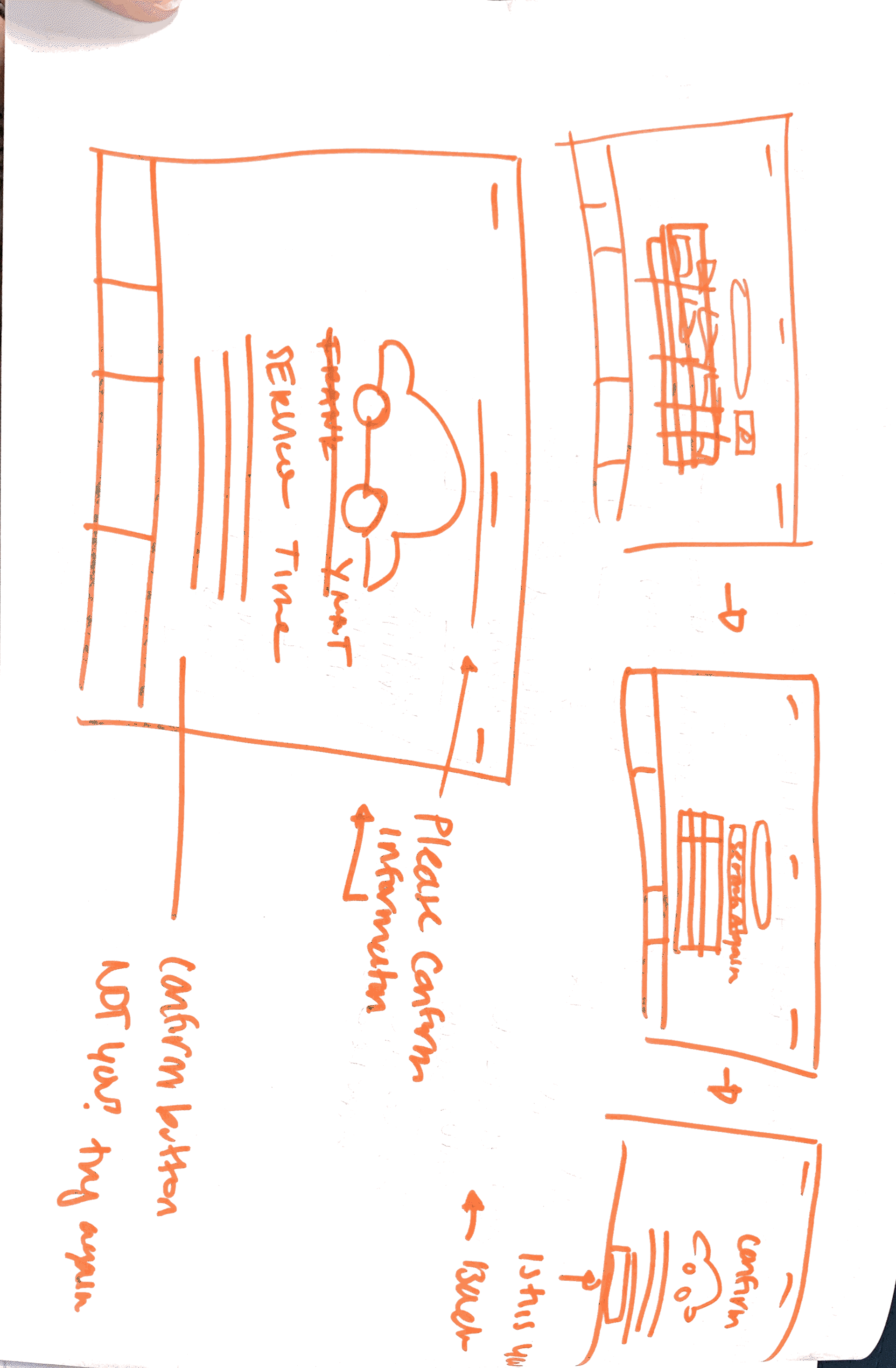
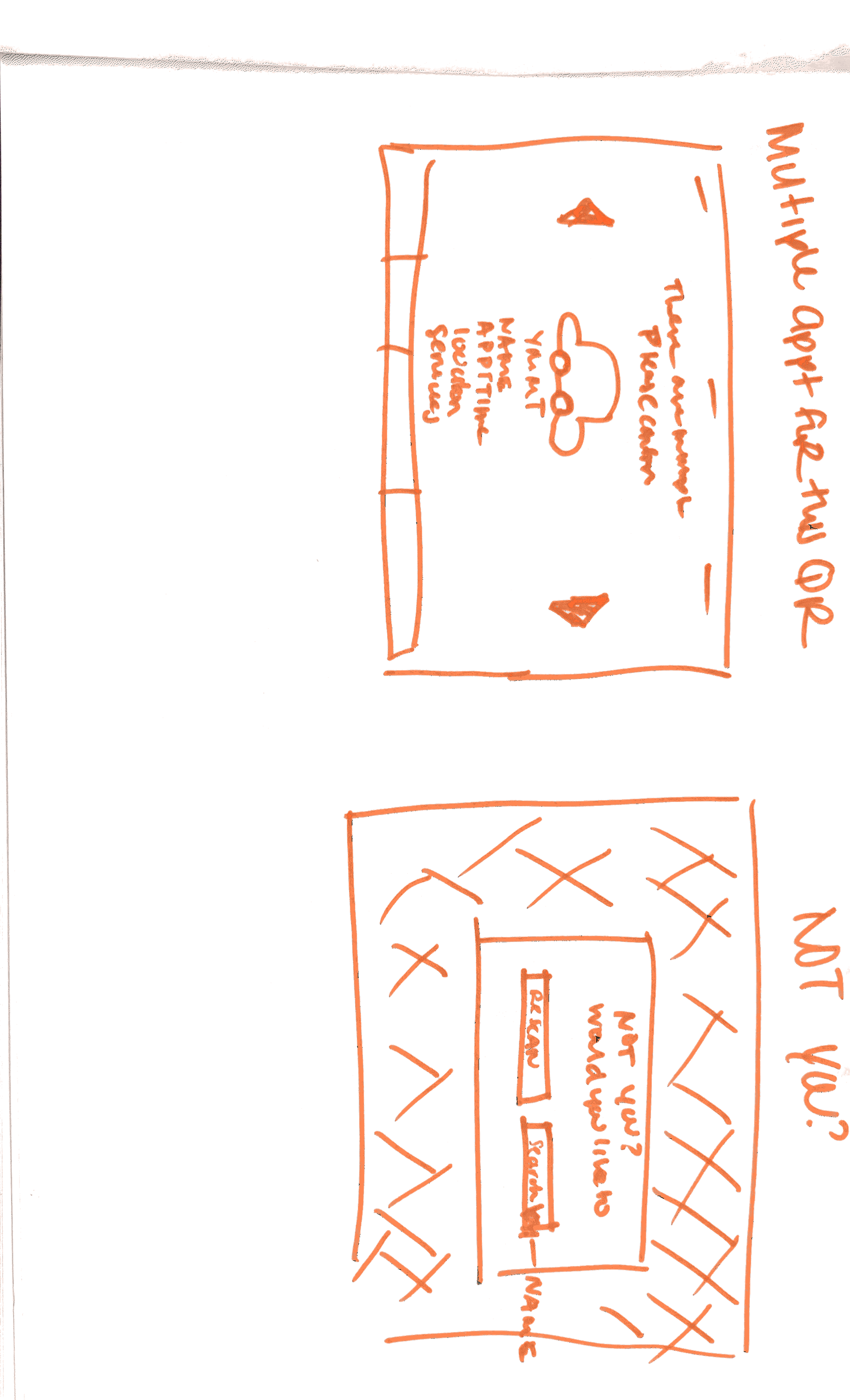
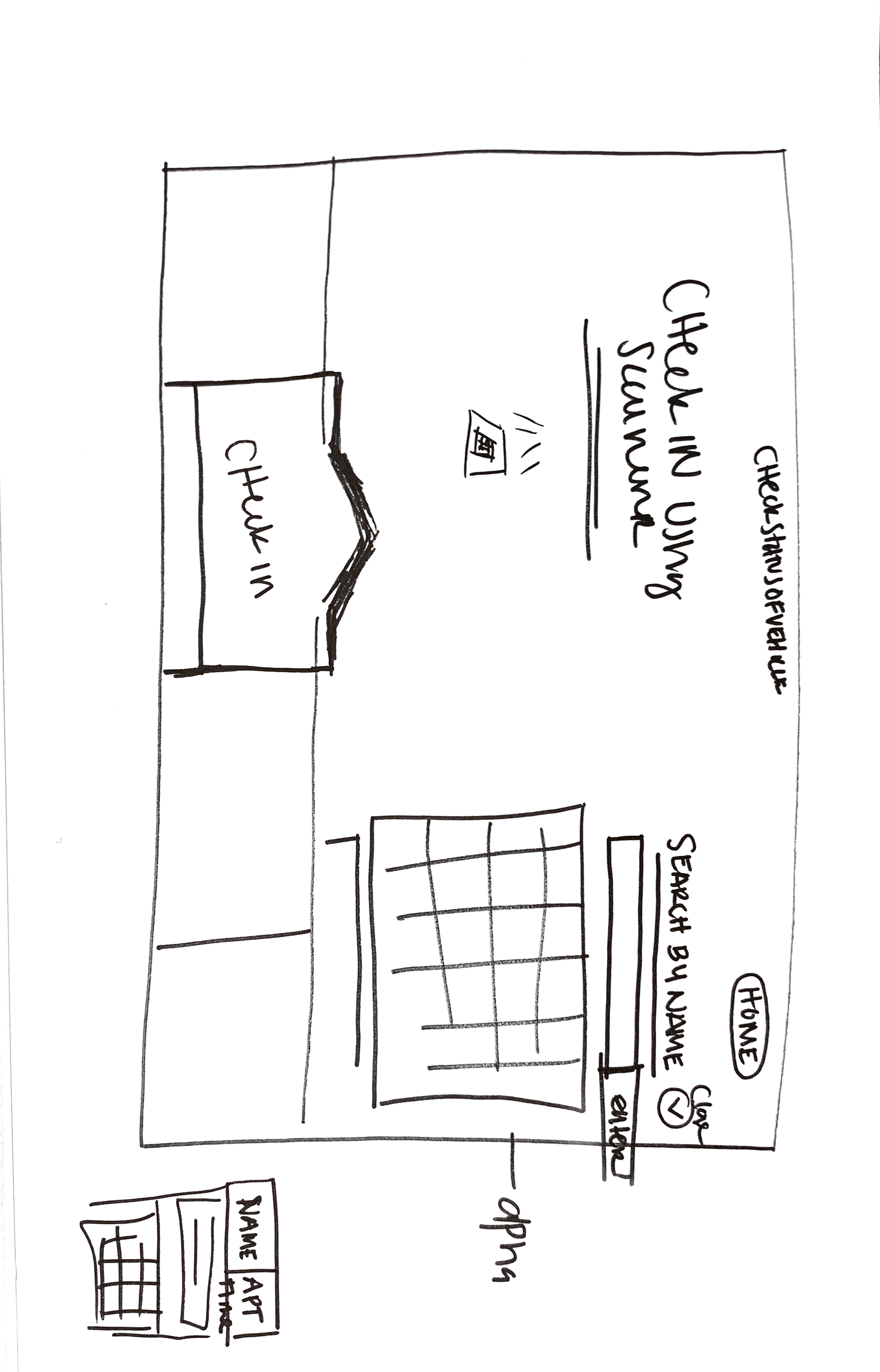
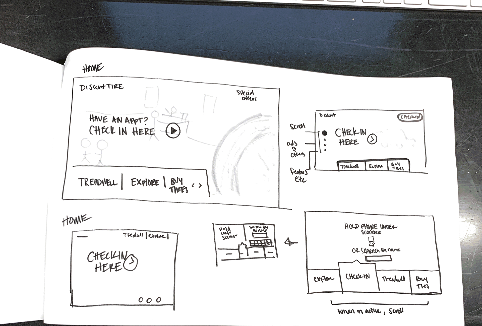
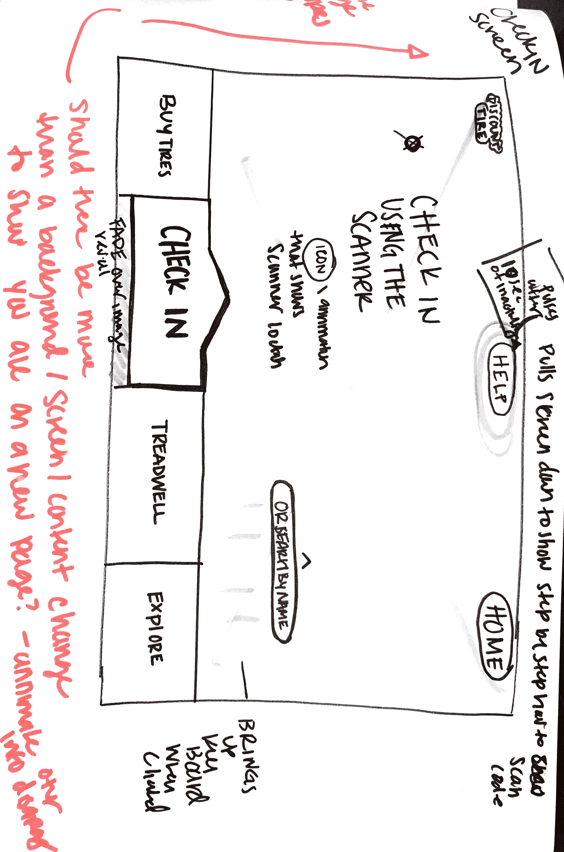
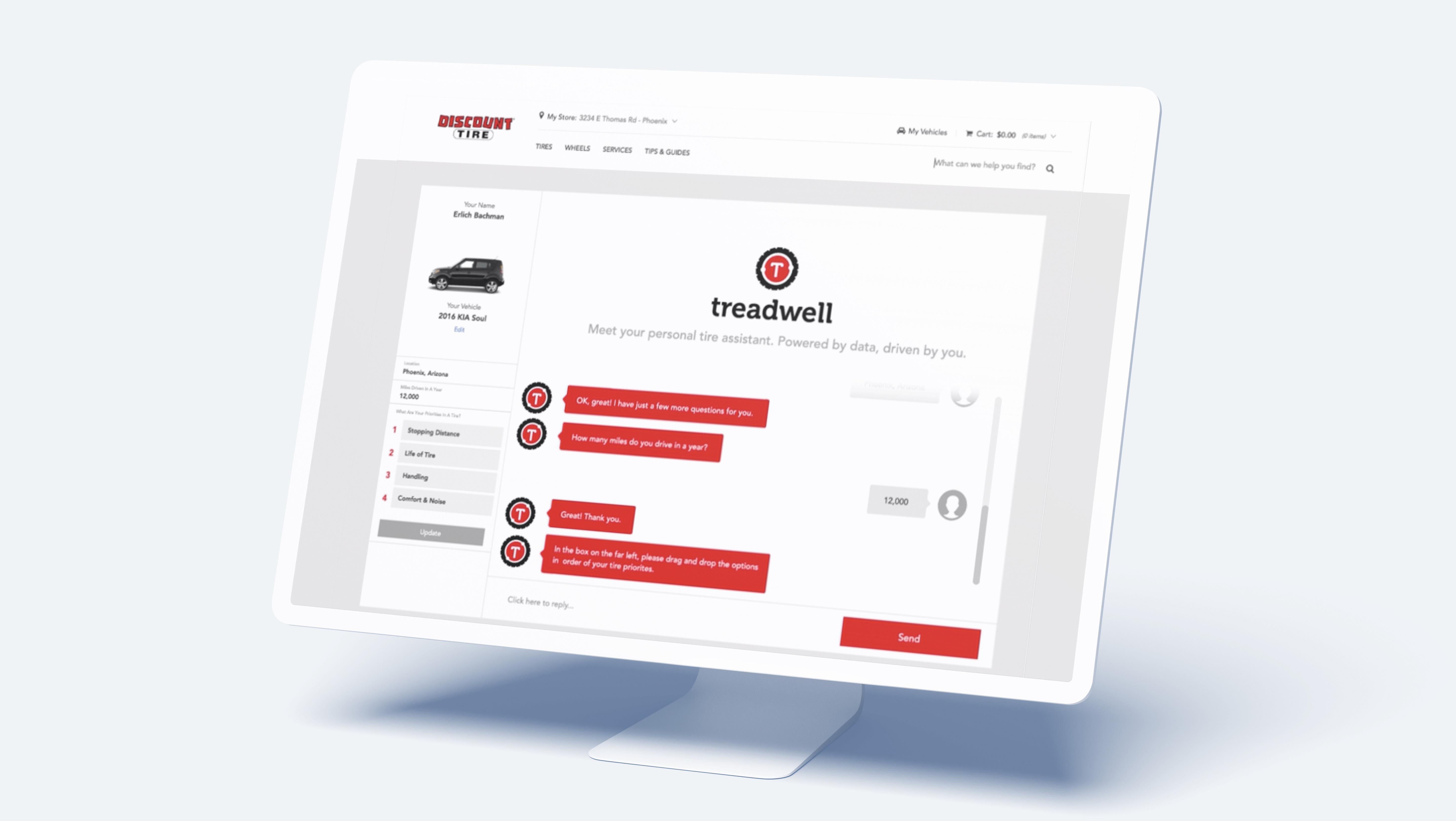
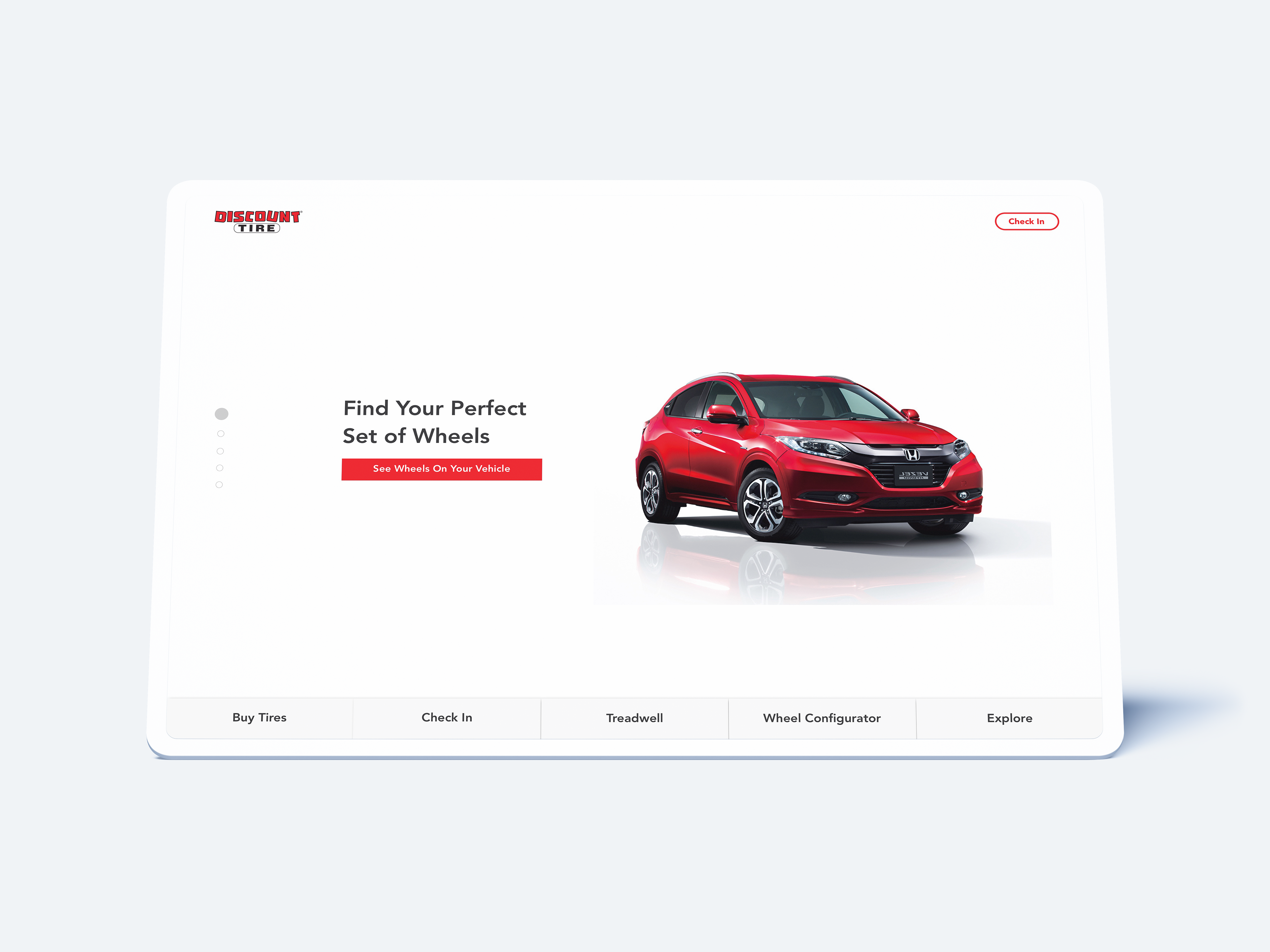
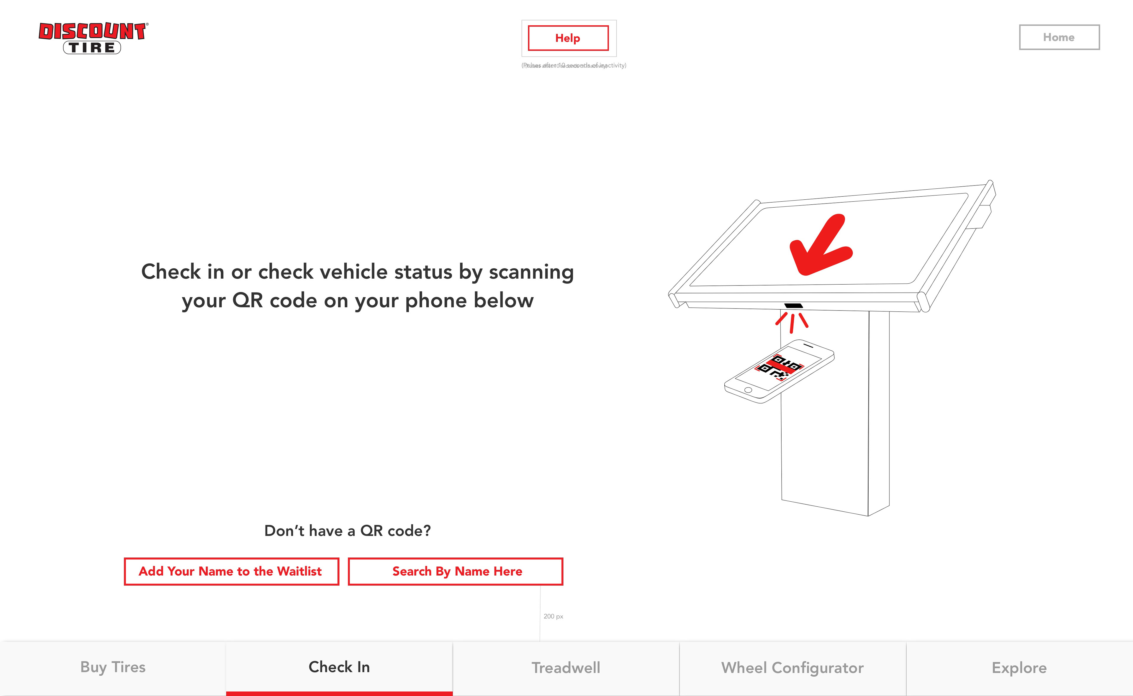
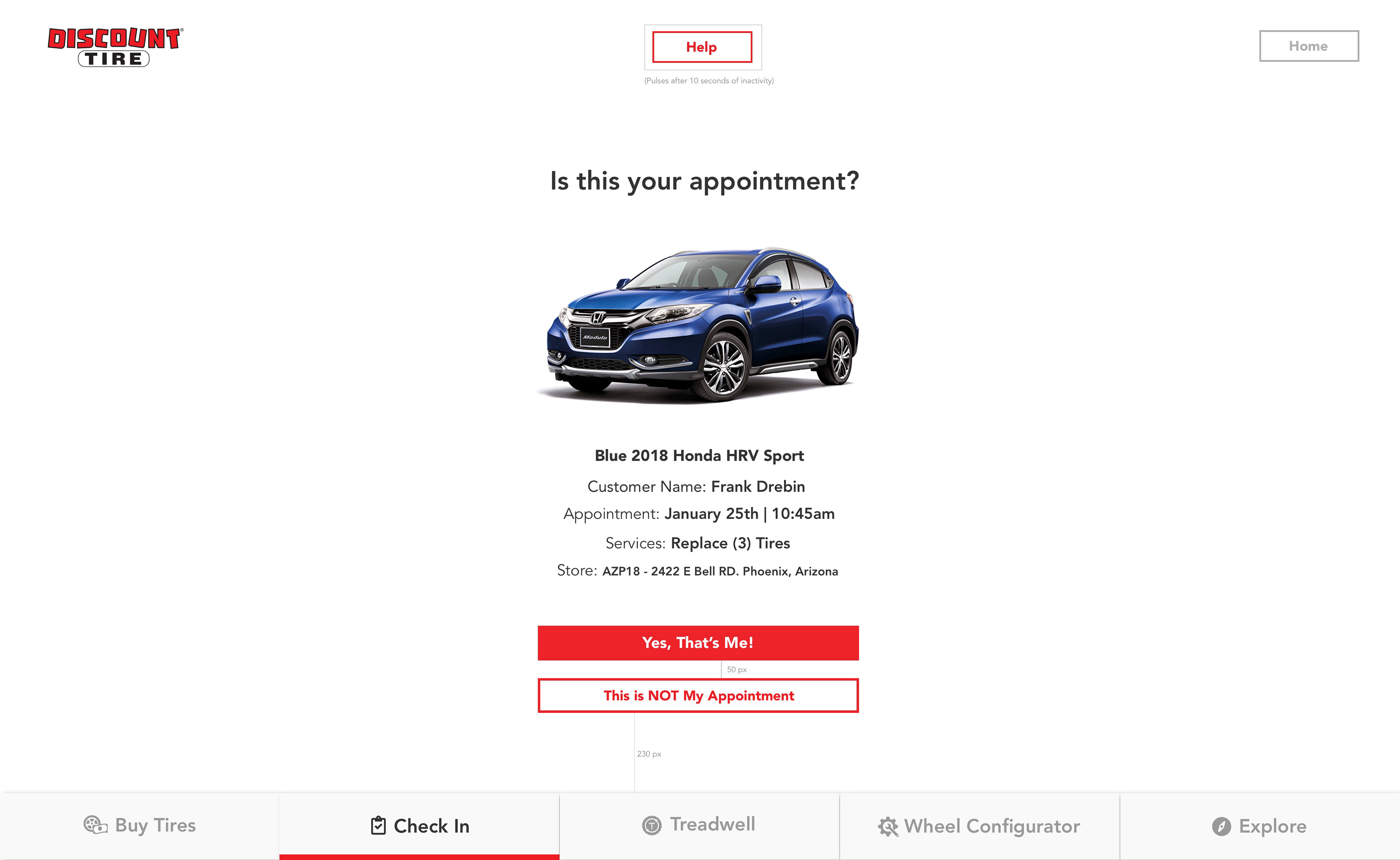
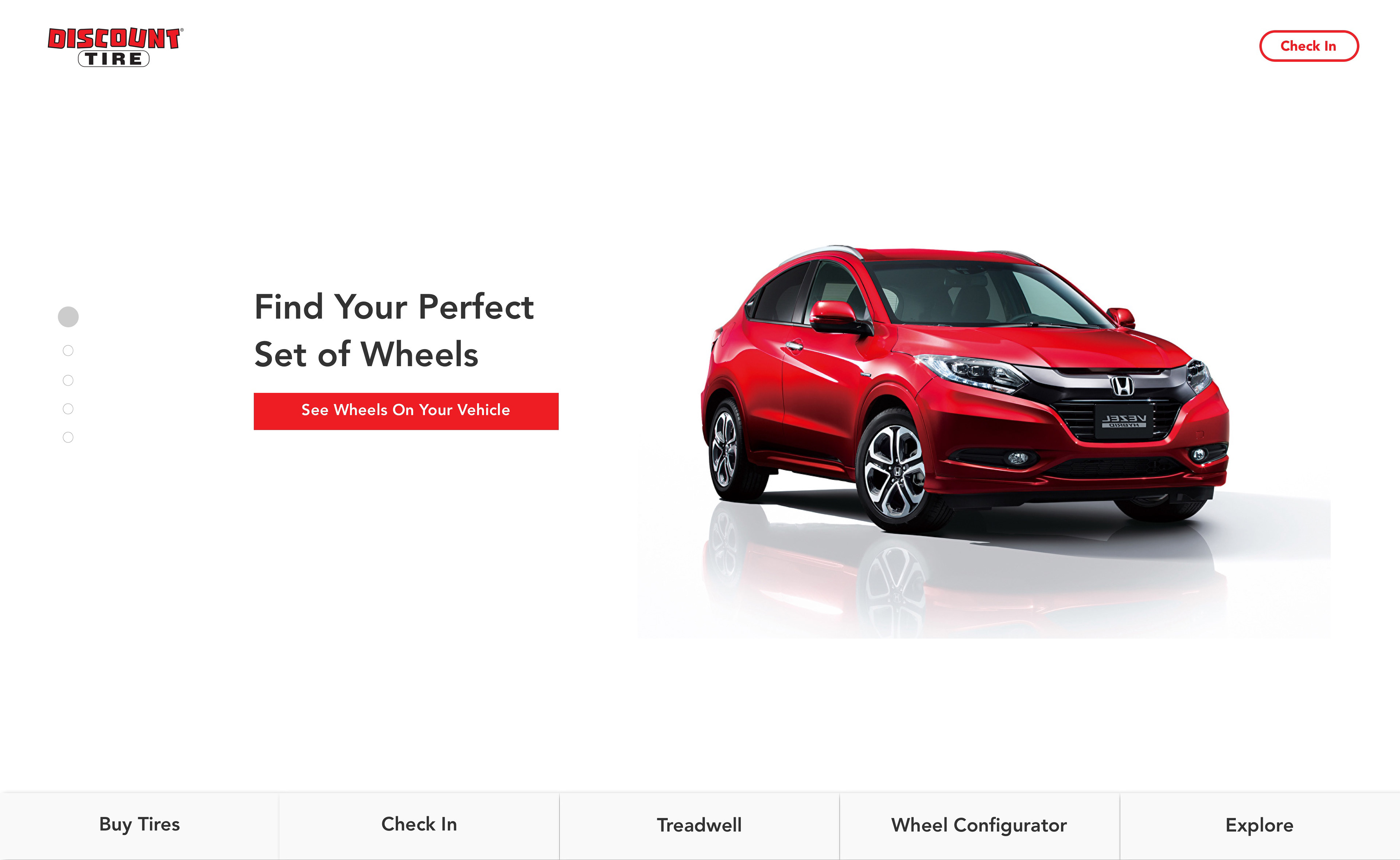
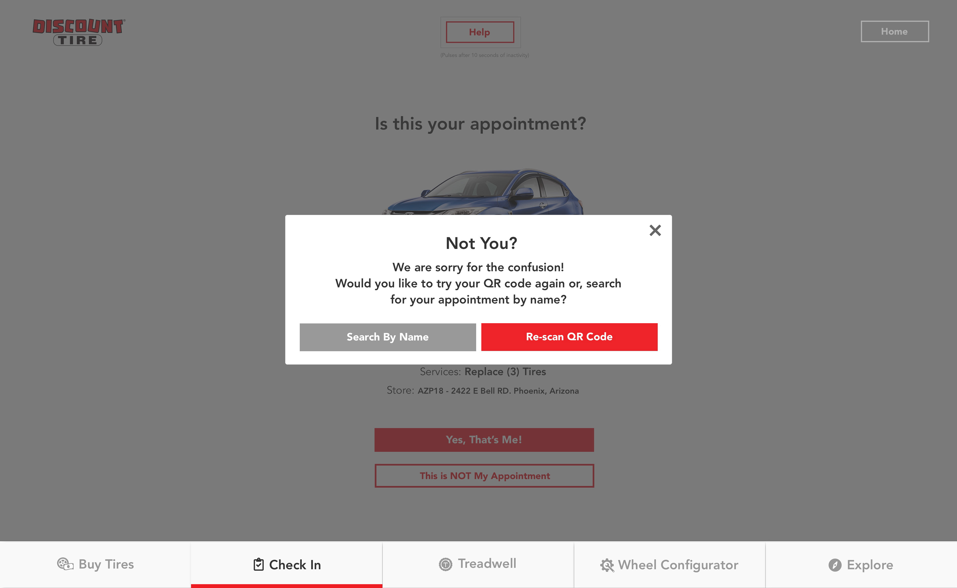
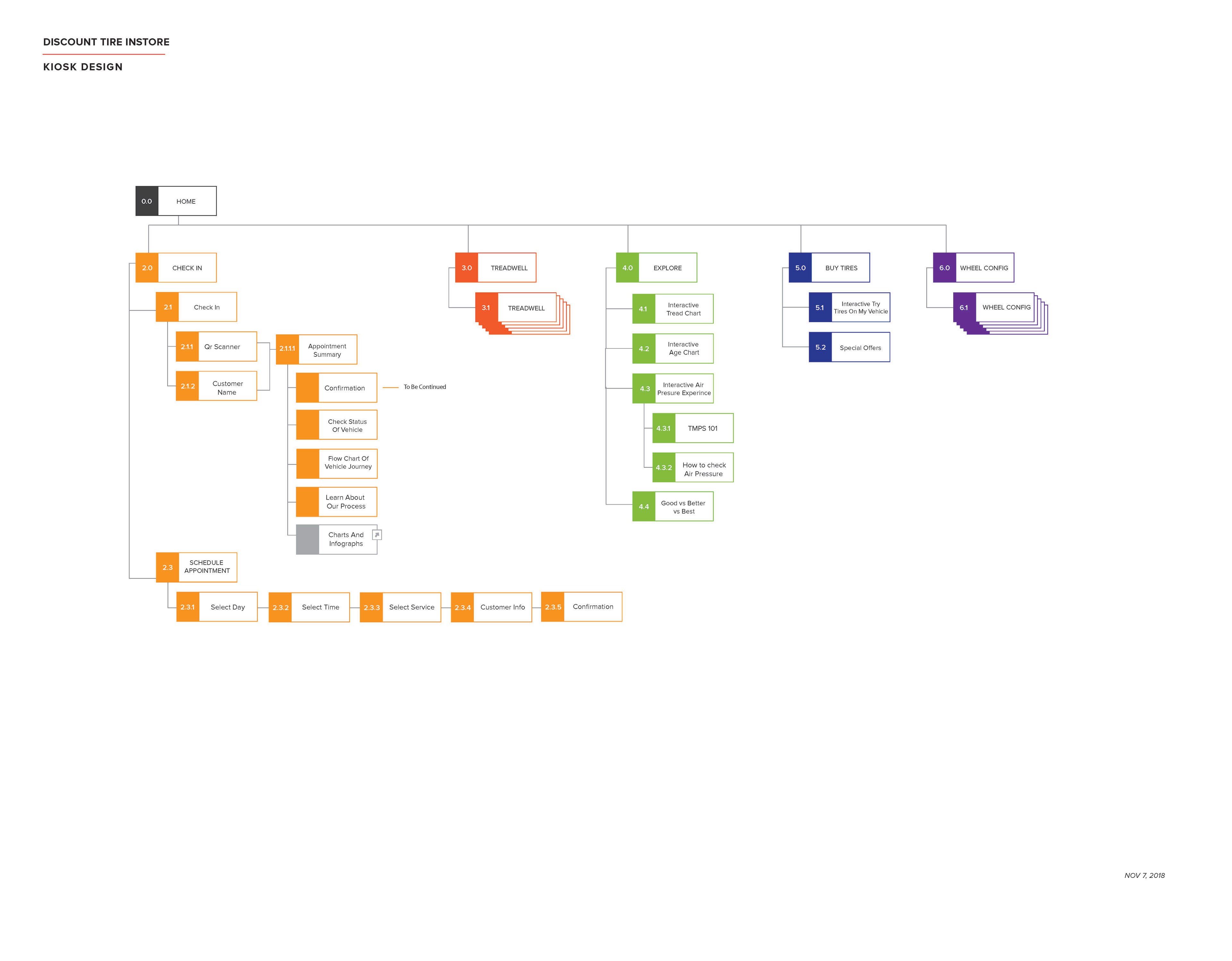
We could have a user create an appointment online. When they arrived at the store, they could be geolocated and confirm their arrival in the app or, they could go inside and interact with the kiosk. In the kiosk, they could scan their QR code from their reservation to find themselves or search for their name in the customer list.
(The QR functionality also solved the issue of customers waiting out in the rain for the store to open. We created posters with QR codes directed to the waitlist app to put on the store window for customers to scan to put themselves in line before the store opened. During COVID, Discount Tire heavily relied on this already-tested feature to make tire buying in a pandemic safer than ever before!)
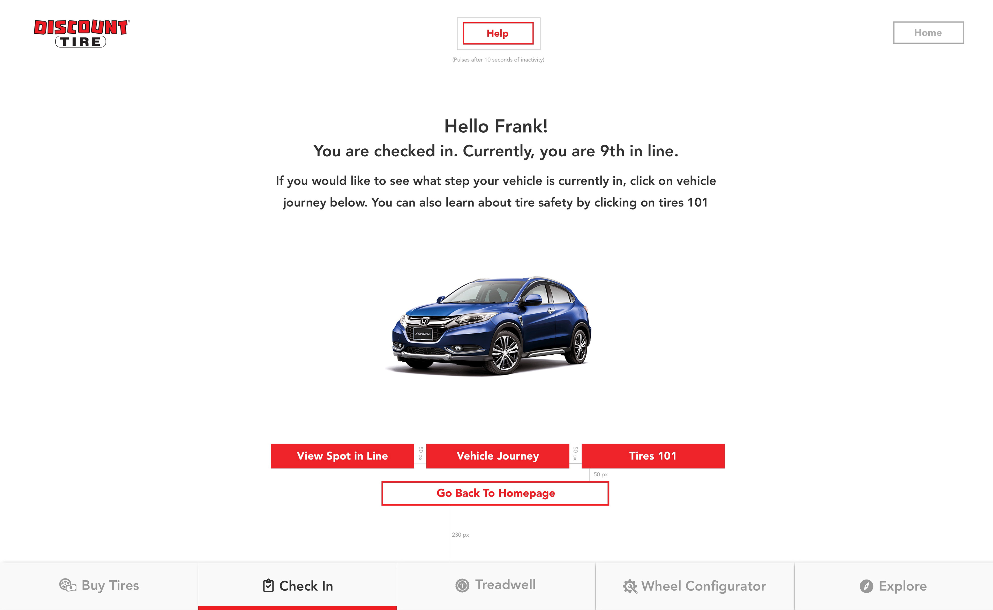
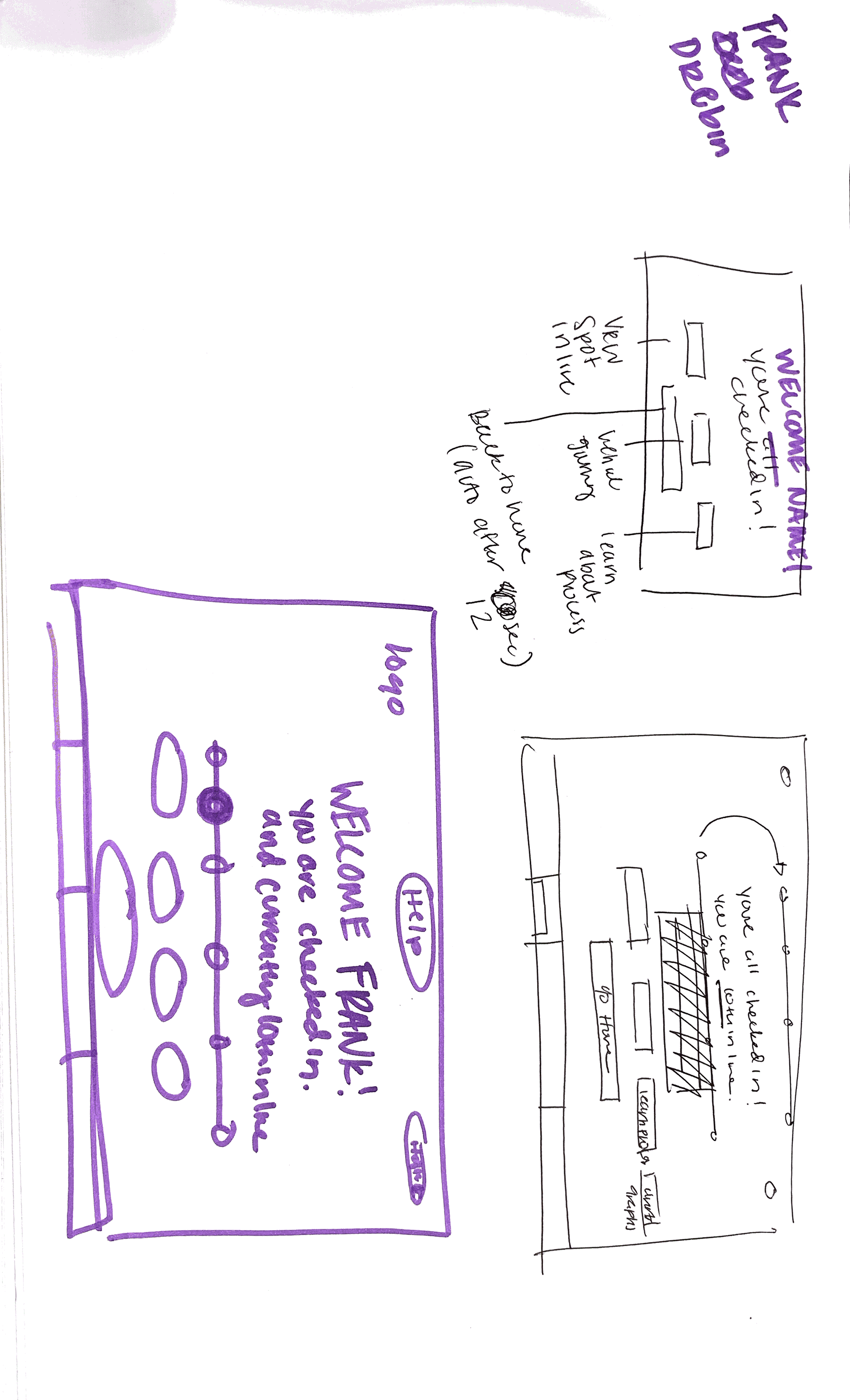
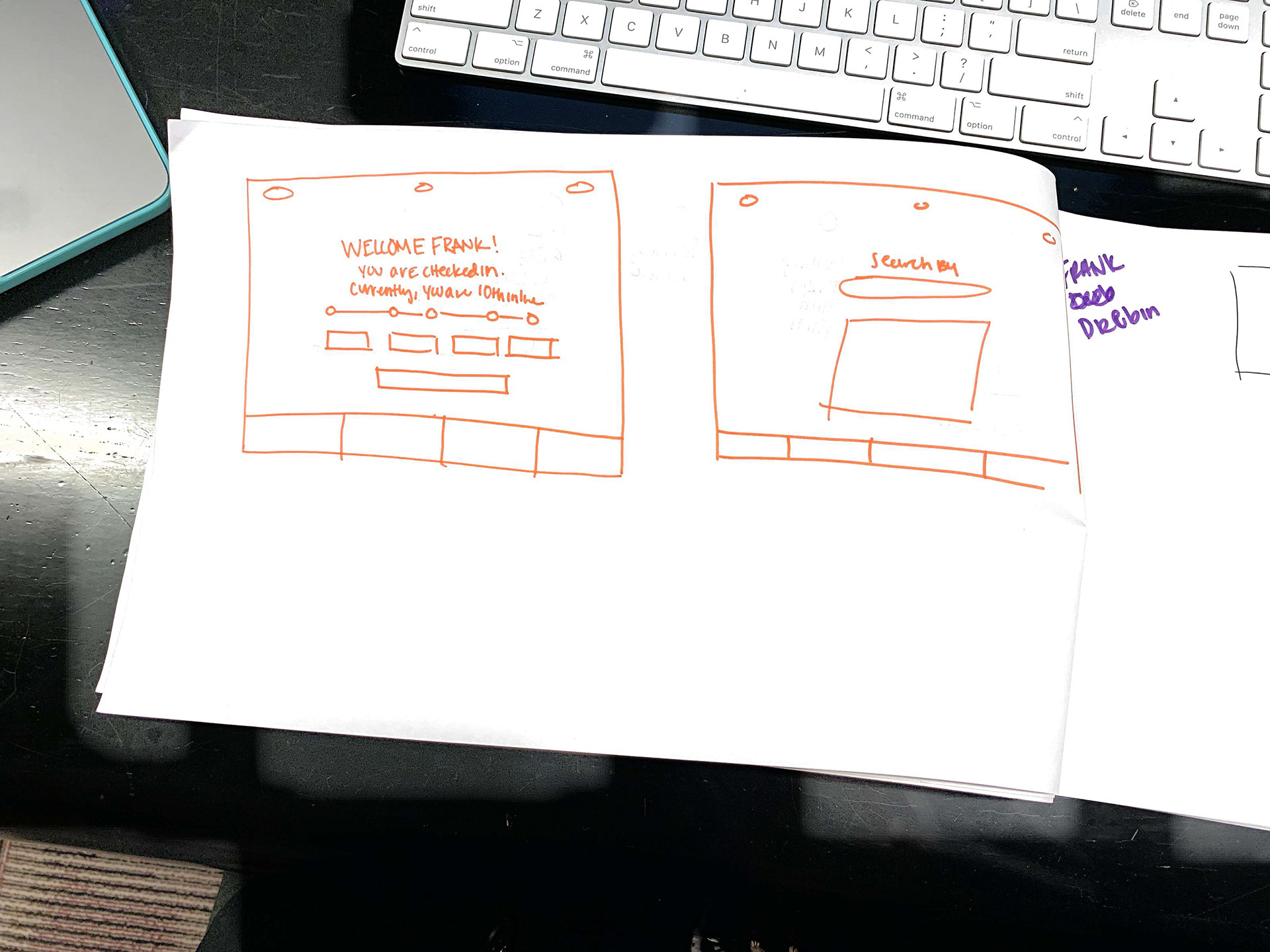
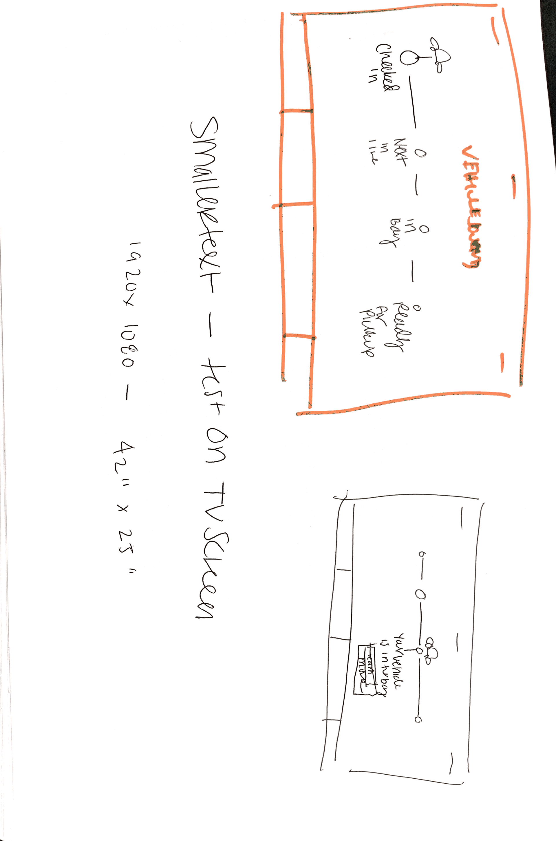
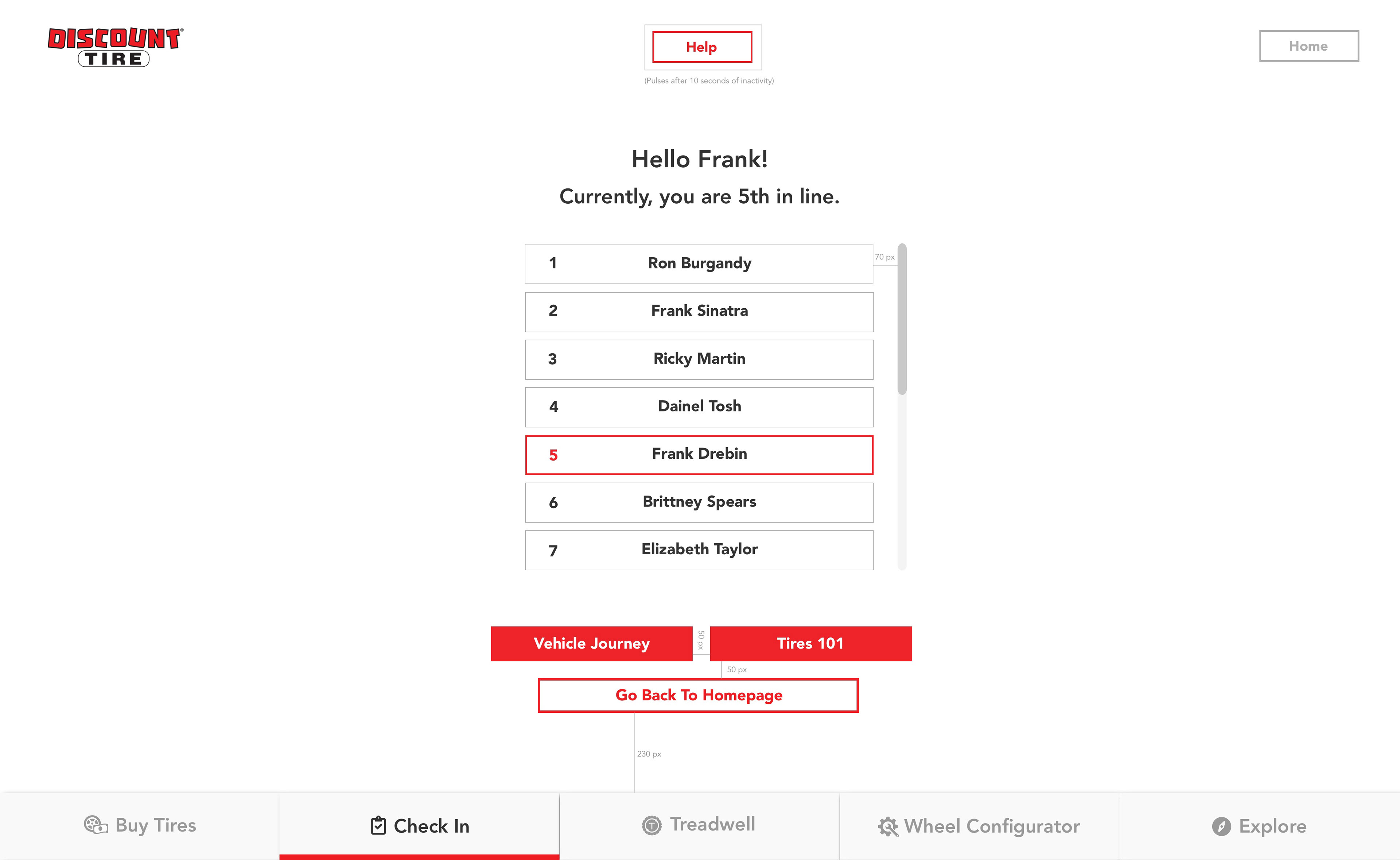
If they were walk-in customers, they could create an appointment and add their names to the list. From there, they can confirm and edit what they were there to do, their vehicle information, and any other information that might be useful for the appointment. Their check-in would connect to a screen, like in the Oregon store, that they could watch and see when their turn was. The store employees could also watch this list to call out the name of the next customer to help.
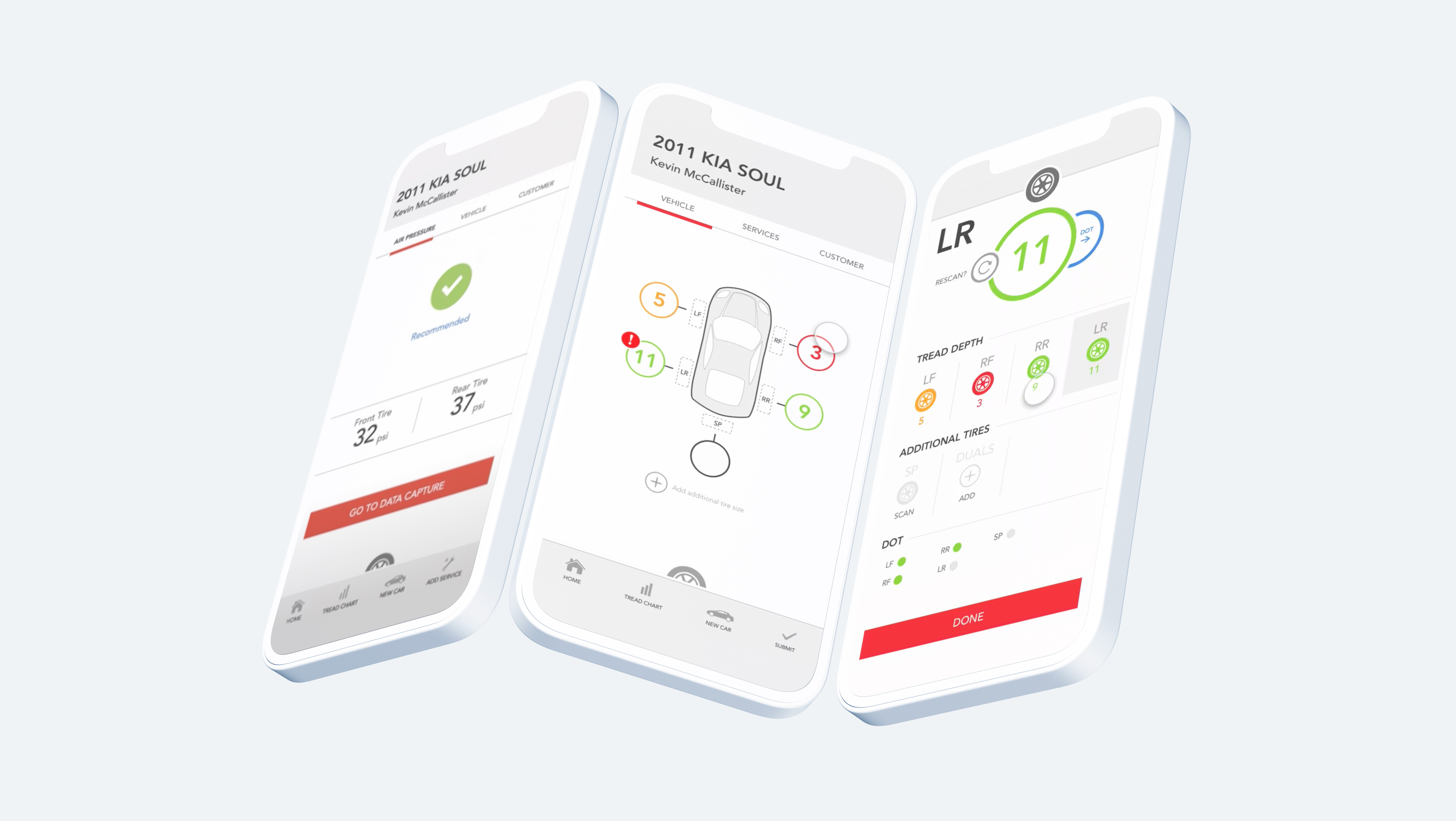
The information on the reservation and edits made through the kiosk or app would be updated in the system, so when the employee walked out to the car to visit the vehicle with the zebra device, the information would be updated. As the customer waited for their car, they could check the kiosk to see what step of the process their car was in and the estimated wait time. They might also be able to see this on their mobile devices.
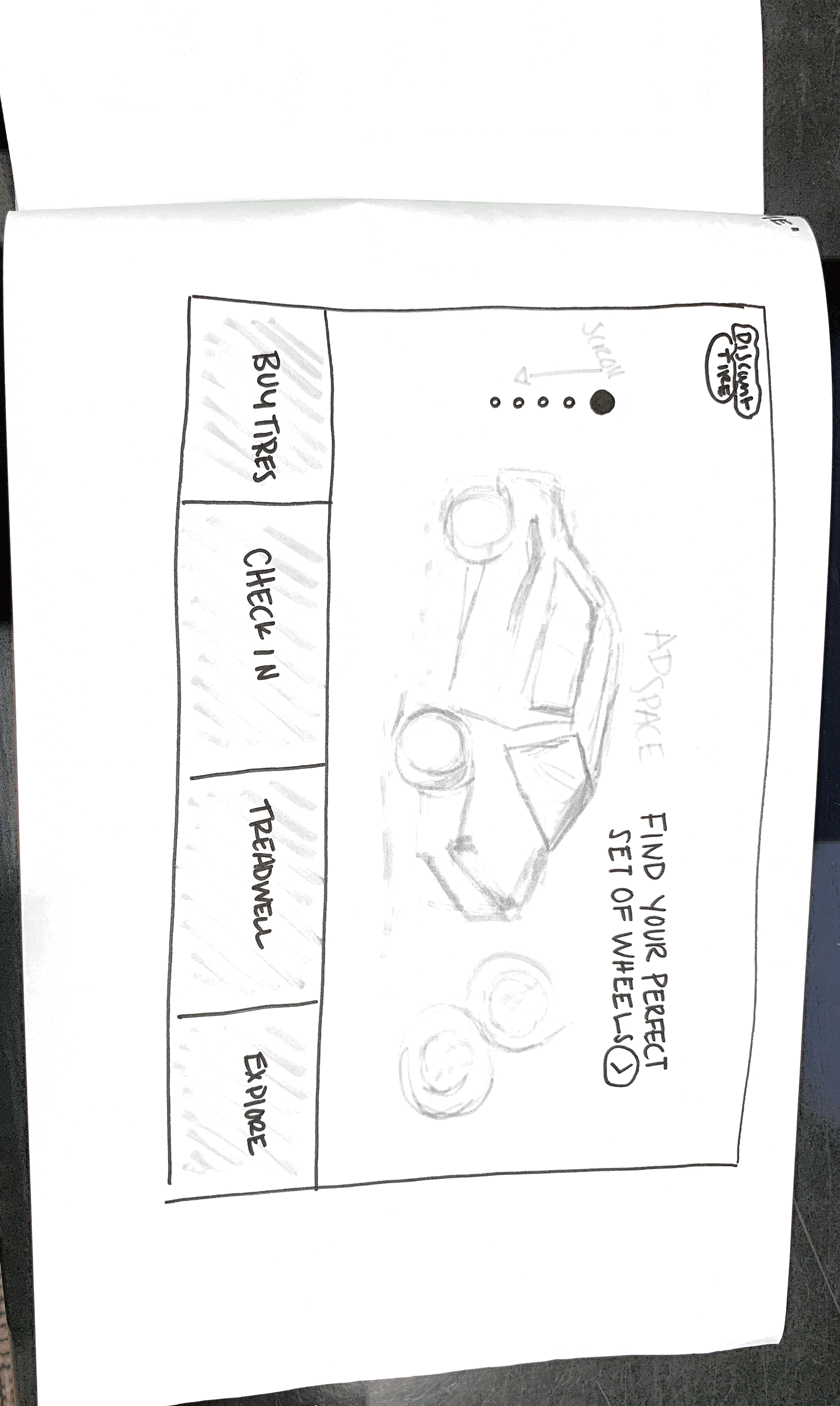
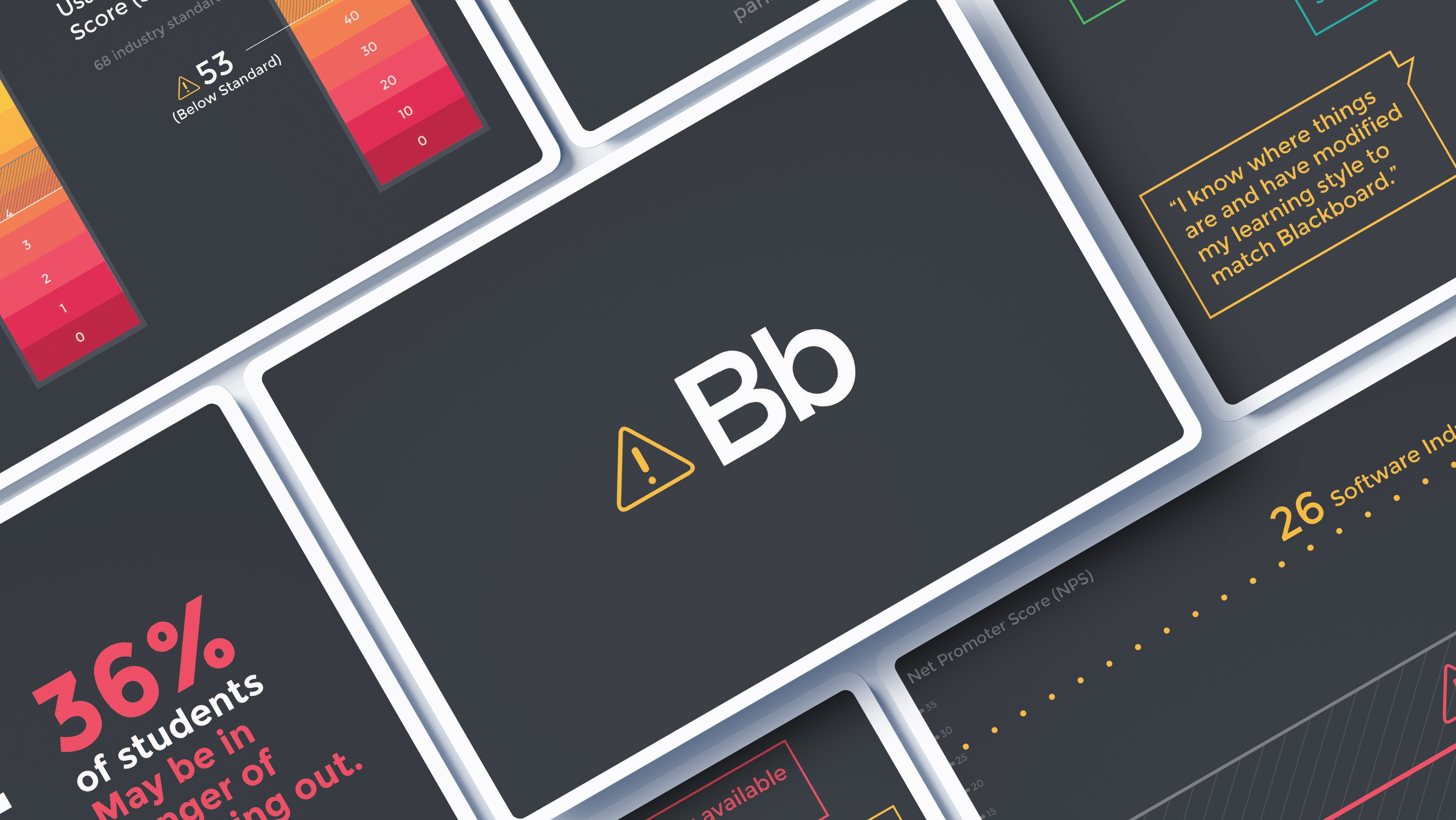
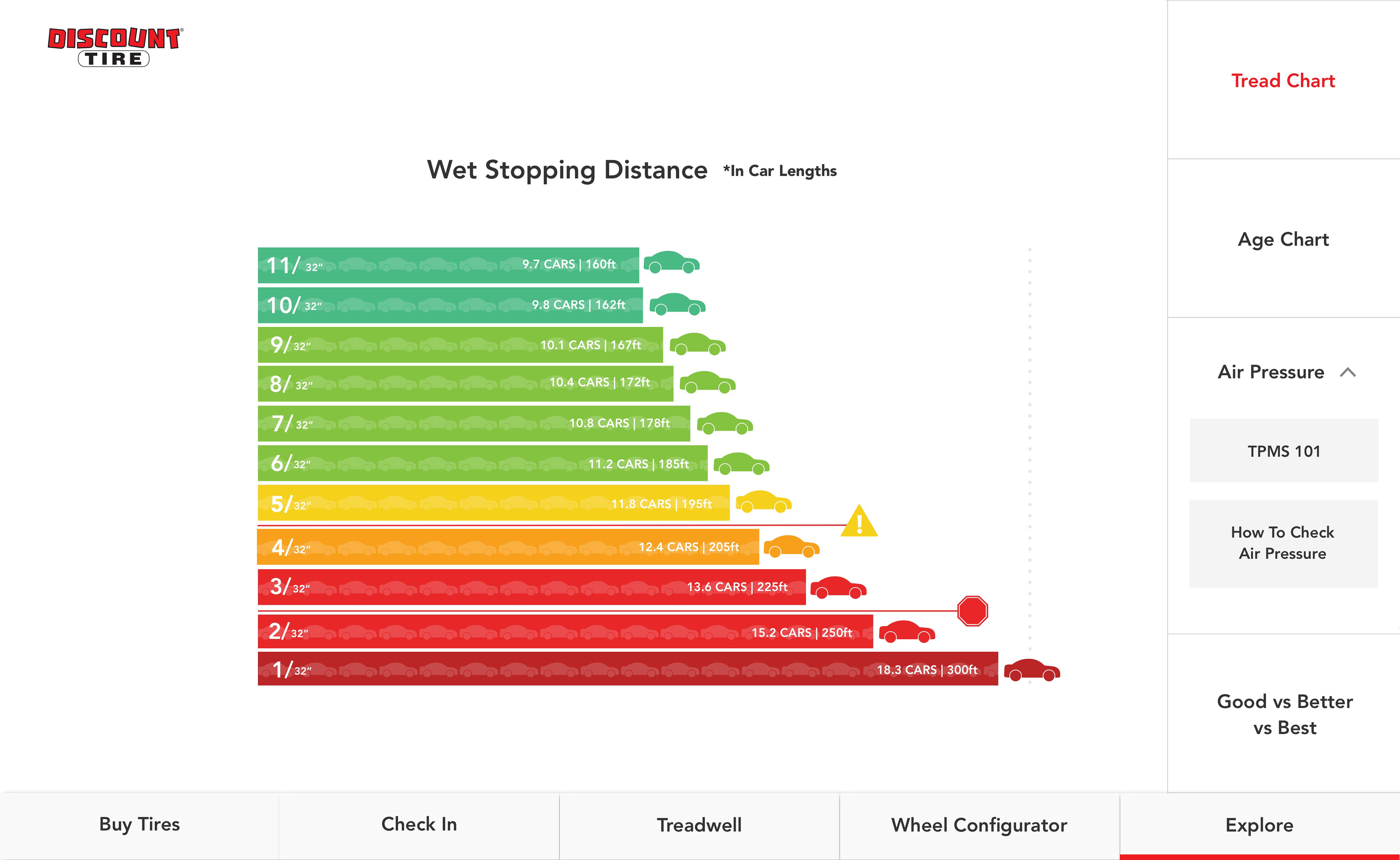
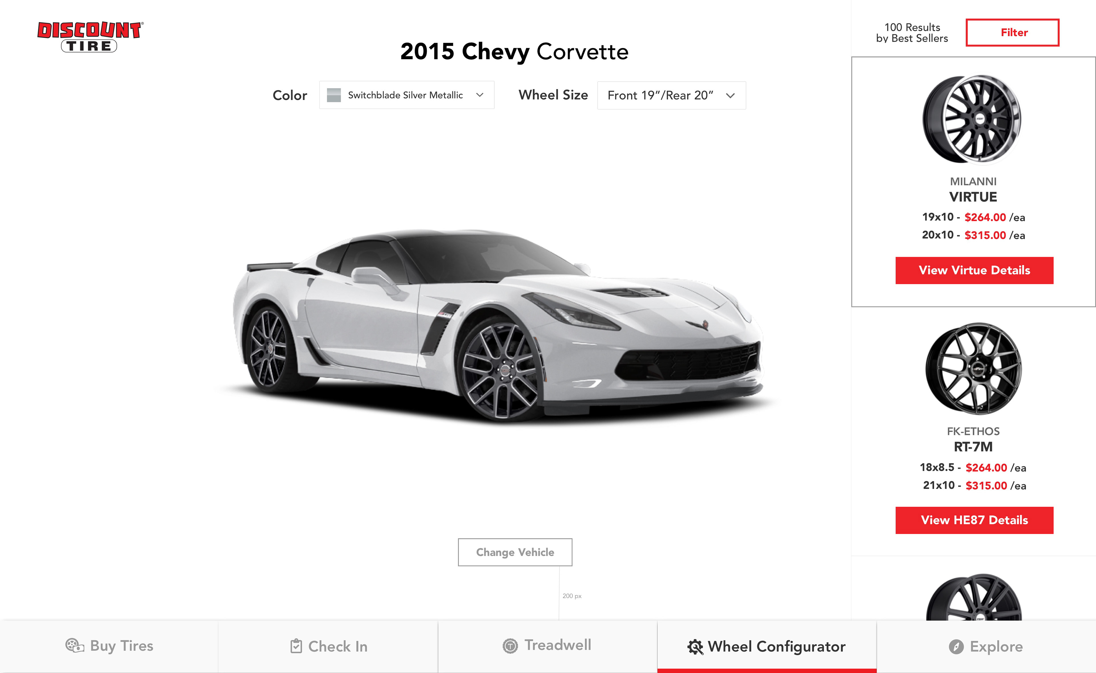
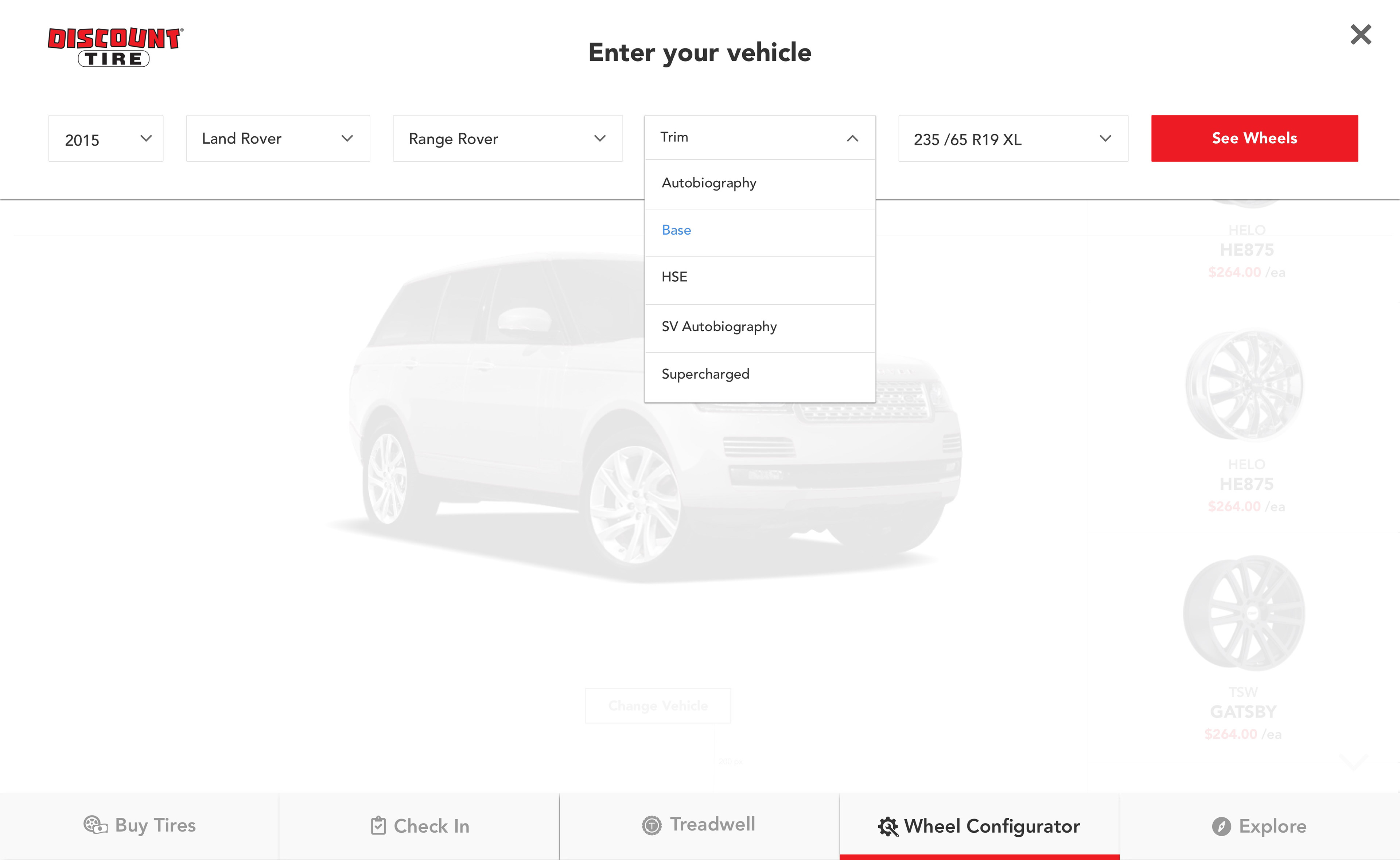
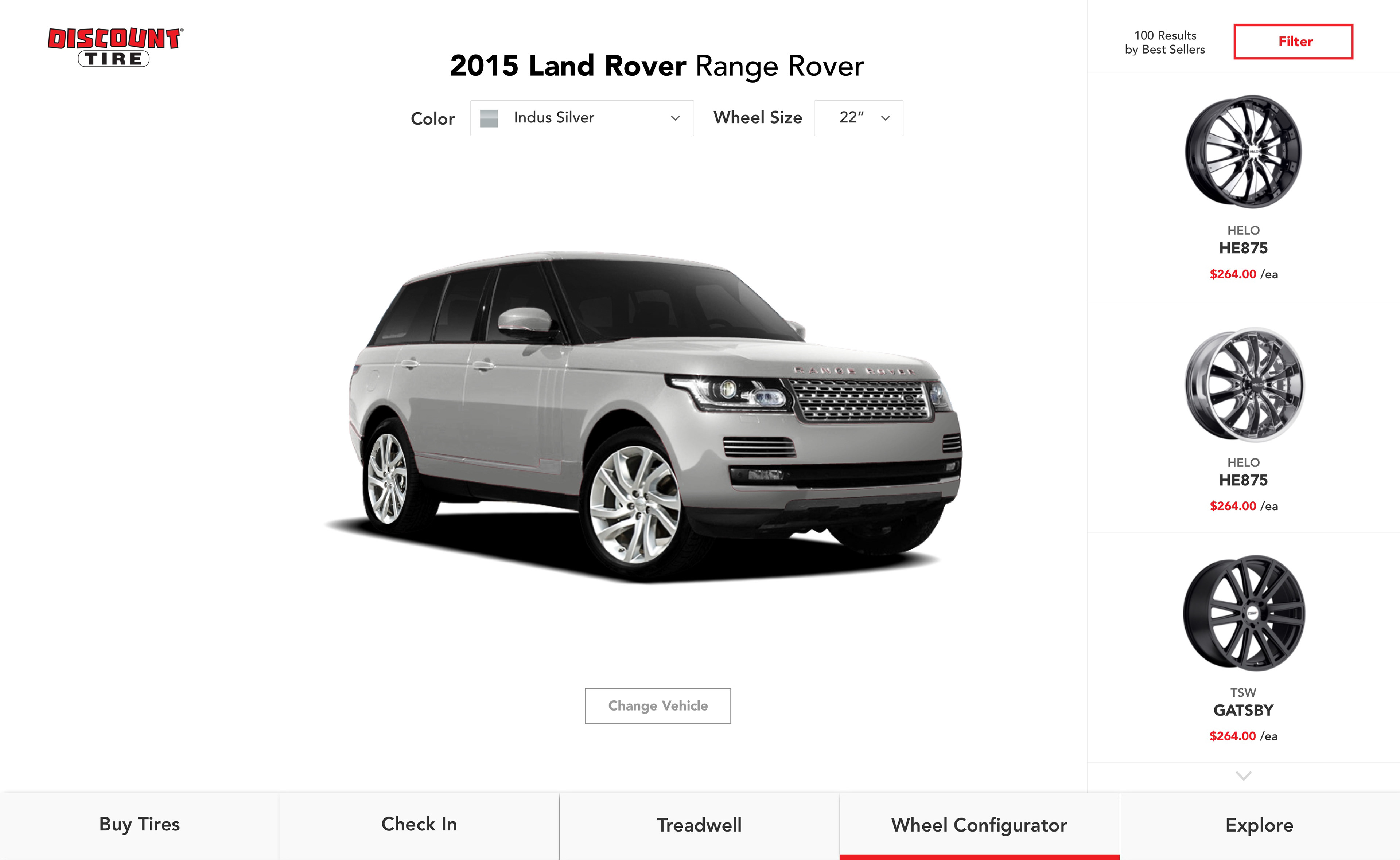
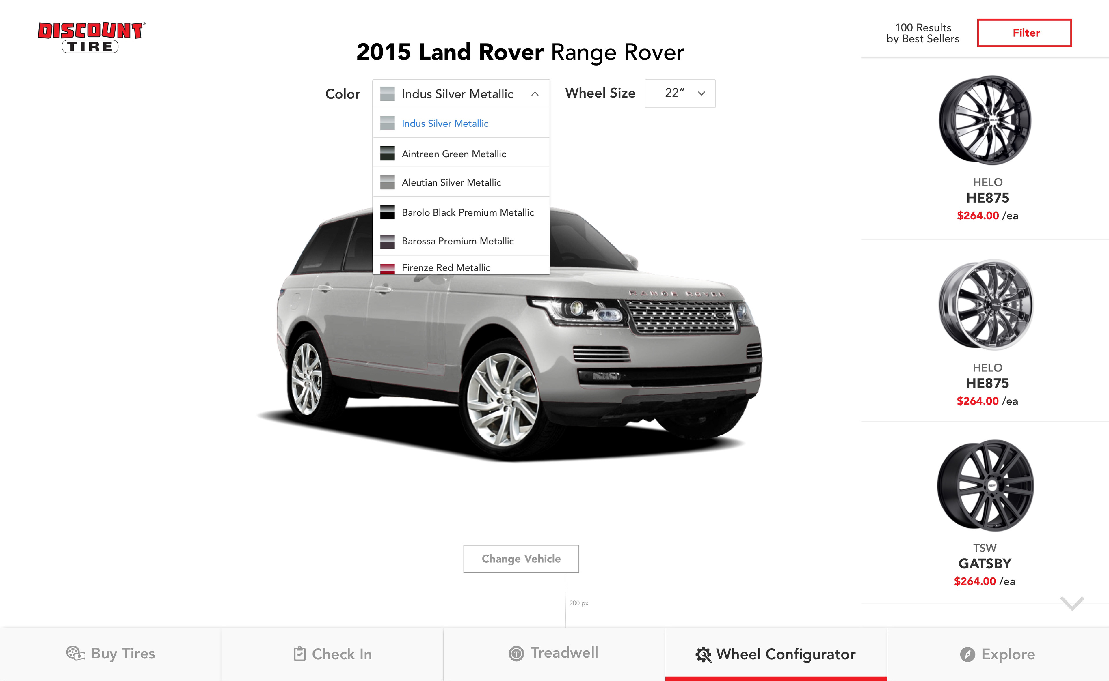
As much as I loved the kiosk solving the check-in problem, I wanted to offer more to the customers and employees. Discount Tire has always been about safety and educating their customers about tire safety. I wanted to integrate that into the kiosk as well by creating fun charts that the customers could explore while they waited. The store employees could also use these charts to explain what was happening to their vehicle's tires. As an added bonus, I added a shop feature. This gave the customer the ability to browse tires and wheels and see how they looked on their vehicle. If they wanted to add these things to their visit, they could do so directly from the kiosk.
The UX Thought Process
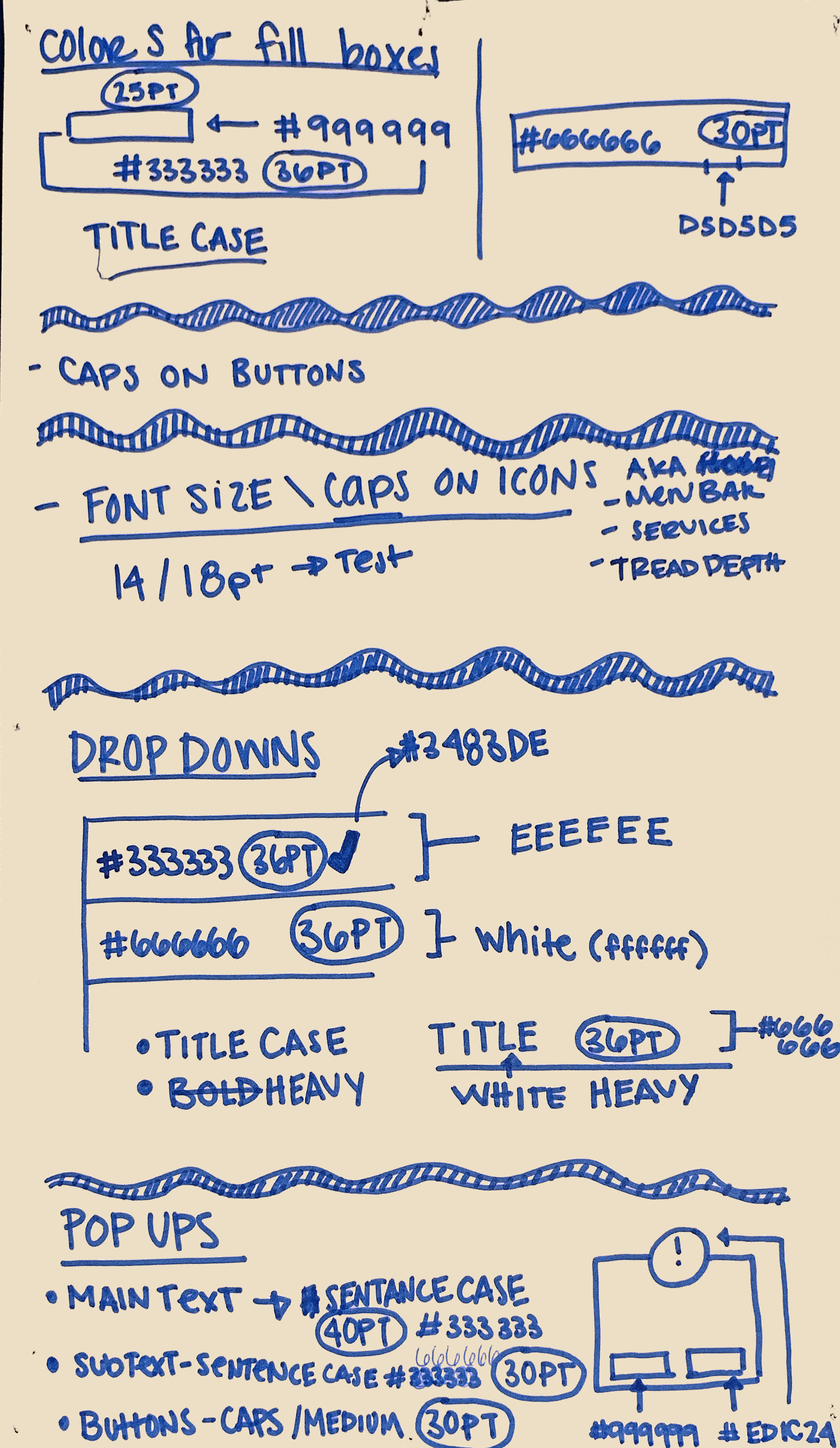
Similar to the UX design of the mobile zebra device, I kept in mind and tested multiple interaction points. I studied multiple people around the office trying to touch buttons and interact with the kiosk screen. The results from these interaction tests changed button sizes, type sizes, button sensitivity, and movement responses. For example, if you are used to swiping a particular way on your phone, your kiosk should match that interaction. Or at least the most common interaction among mobile phone owners.
In essence, a kiosk is a giant tablet and should be designed as such, the buttons should be easily read and touchable without precision. It should also be easily understood by all demographics.
However, you have to account for some oddities. For example, multiple interactions at once; sometimes from maybe a child on the other end of the kiosk, or maybe your own elbow. I also designed the kiosk with Fitts law in mind. This made grouping tasks in similar locations very important to the overall design.
-----
"It seems like a far-fetched idea to have a tire store with some of the most up-to-date tech utilized. Many people are still confused When I mentioned that I worked on the product team at Discount Tire. But the truth of the matter is that Discount Tire has more up-to-date technology in their stores than some of the big-name stores like Target and Walmart. While working at Discount tire I was fortunate enough to work on industry-leading mobile tech with zebra devices, AR tech to let customers try tires at home before they bought them, Google home devices, AI chatbots, and in-store kiosks."
-----
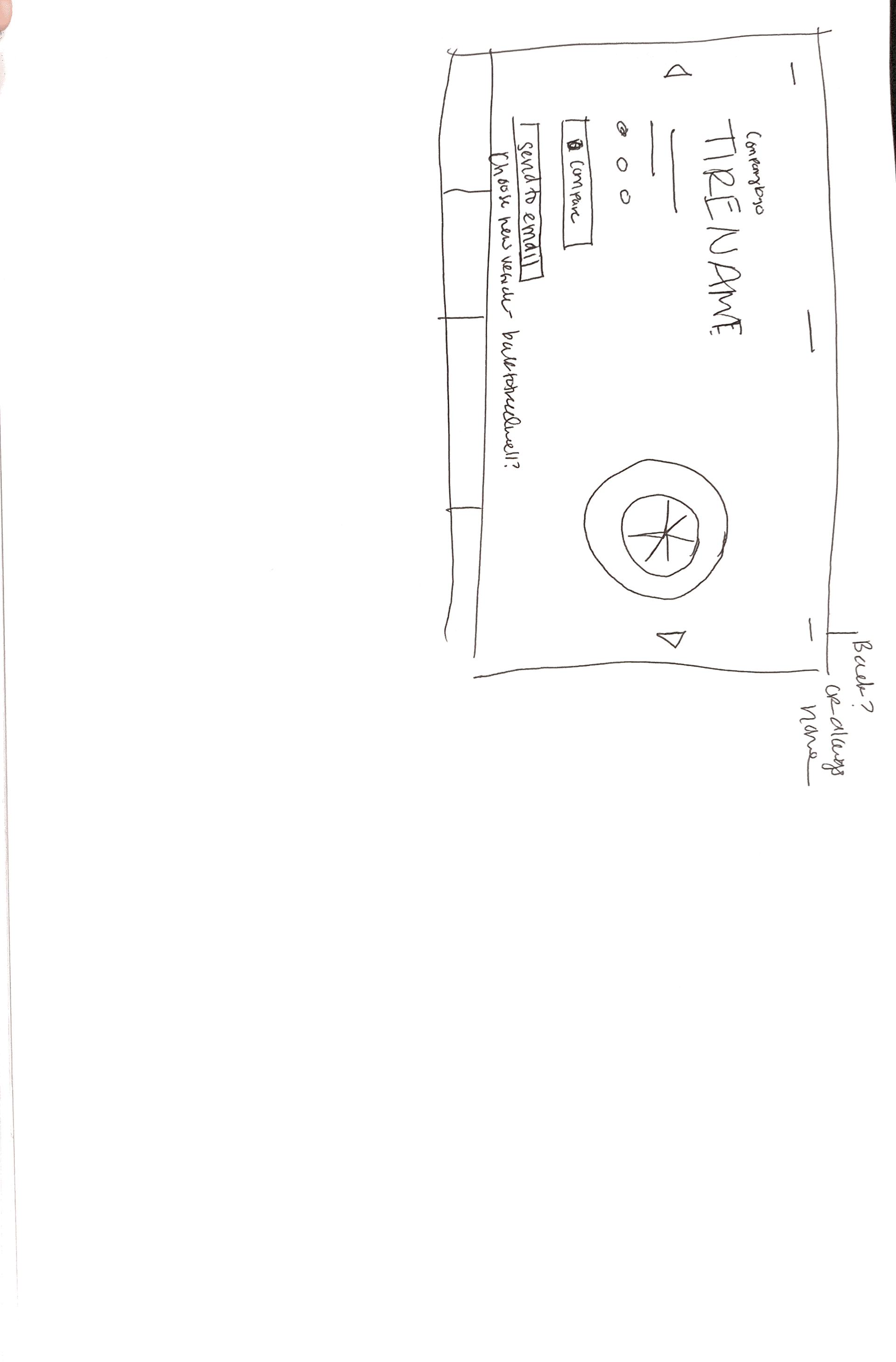
Sketches and Thoughts